In the chapter 10, we built a slew of models. How do we know if they are any good? Answering this question may seem straightforward in some respects, but it's not. When evaluating models, we are best served by inspecting a portfolio of statistics and plots. Every model will have comparative strengths and weaknesses. A single metric will not be full-bodied enough to communicate such a fact. This is why something like a dashboard provided by an off-the-shelf tool will never suffice We need to inspect a large mix of stats and plots, some of which may be highly-specific to our modeling problem.
A paramount qualification is knowing what we need our model to do. We must understand where our model needs to be strong and where we can afford for it to be weaker. For our churn model, let's say our marketing department is strapped for time and can only reach out to people we think have a very high probability of defaulting. As long as our model can pick out these folks, we're in good shape. We can live with our model, say, inflating probabilities for people on the low end of the distribution. At the end of the day, we want a model optimized for business action not just classic metrics of predictive power. Off-the-shelf tools only understand numbers and not the broader context. They cannot understand "useful" models.
In this chapter, we will review a number of methodologies for assessing our models. Based on this review, we will select the model or models we want to put into production. Don't breeze through this part of the process. The evaluation step can also spur ideas about how to improve our model (though we also need to be cognizant to not cater to the test set too much, which is another form of overfitting). After we see where our model is strong and weak, we can go back and tweak our hyperparameter search or feature engineering. For example, if our model really only needs to pinpoint the very riskiest customers and it is struggling in that area, we might need to brainstorm and incorporate features that could better identify these individuals. Recall that much of data science is recursive. We try something, test what we tried, and either backtrack or move forward.
We always want to evaluate our model on data it was not trained on. If we evaluate our model on the training data, our assessment will be overly optimistic. There is a good chance we have modeled some noise in the training set and will produce some predictions that are too good to be true. We, therefore, need to evaluate our model on the test set, which is a random sampling of the dataset (if this is not a time-series problem). For this problem, we are blessed with a large dataset so we can have a sizable test set. If we were dealing with a smaller dataset and a limited-sized test set, we would have to be more creative. For one, we could potentially take samples of our test set, evaluate each sample, and then average the results. There's a chance that each sample could be too small, and our results would then be too volatile, though. No silver bullet exists.
In this section, we give a high-level overview of how our model evaluation is implemented. We'll point out the most important elements, though the nitty-gritty details and much of the discussion will occur in subsequent sections. First, here is the entire code for modeling/evaluation.py. It's a meaty file.
import pandas as pd | |
import numpy as np | |
import os | |
import seaborn as sns | |
import matplotlib.pyplot as plt | |
import matplotlib.lines as mlines | |
import scikitplot as skplt | |
import itertools | |
import multiprocessing as mp | |
from sklearn.calibration import calibration_curve | |
from sklearn.metrics import plot_roc_curve, roc_curve, confusion_matrix | |
from mlxtend.evaluate import lift_score | |
from mlxtend.evaluate import mcnemar, mcnemar_table, cochrans_q, bias_variance_decomp | |
from mlxtend.plotting import checkerboard_plot | |
from scipy.stats import ks_2samp | |
from helpers.model_helpers import make_directories_if_not_exists | |
from data.db import log_model_scores_to_mysql | |
def produce_predictions(estimator, model_uid, x_test, y_test, class_cutoff): | |
""" | |
Produces a dataframe consisting of the probability and class predictions from the model on the test set along | |
with the y_test. The dataframe is saved locally. | |
:param estimator: estimator object | |
:param model_uid: model uid | |
:param x_test: x_test dataframe | |
:param y_test: y_test series | |
:param class_cutoff: the probability cutoff to separate classes | |
:returns: pandas dataframe | |
""" | |
df = pd.concat( | |
[ | |
pd.DataFrame(estimator.predict_proba(x_test), columns=['0_prob', '1_prob']), | |
y_test.reset_index(drop=True) | |
], | |
axis=1) | |
df['predicted_class'] = np.where(df['1_prob'] >= class_cutoff, 1, 0) | |
df = df[['predicted_class'] + [col for col in df.columns if col != 'predicted_class']] | |
df.to_csv(os.path.join('modeling', model_uid, 'diagnostics', 'predictions', 'predictions_vs_actuals.csv'), | |
index=False) | |
return df | |
def _evaluate_model(target_series, prediction_series, scorer, metric_name): | |
""" | |
Applies a scorer function to evaluate predictions against the ground-truth labels. | |
:param df: pandas dataframe containing the predictions and the actuals | |
:param target_series: target series | |
:param prediction_series: prediction series | |
:param scorer: scoring function to evaluate the predictions | |
:param metric_name: name of the metric we are using to score our model | |
:returns: pandas dataframe | |
""" | |
score = scorer(target_series, prediction_series) | |
df = pd.DataFrame({metric_name: [score]}) | |
return df | |
def run_and_save_evaluation_metrics(df, target, model_uid, evaluation_list, db_schema_name, db_conn, log_to_db): | |
""" | |
Runs a series of evaluations metrics on a model's predictions and writes the results locally. | |
:param df: pandas dataframe containing the predictions and the actuals | |
:param target: name of the target column | |
:param model_uid: model uid | |
:param evaluation_list: list of named tuples, which each tuple having the ordering of: the column with the | |
predictions, the scoring function callable, and the name of the metric | |
:param db_schema_name: database schema to log metrics to | |
:param db_conn: database connection | |
:param log_to_db: Boolean of whether to log metrics to the database | |
""" | |
main_df = pd.DataFrame() | |
for evaluation_config in evaluation_list: | |
temp_df = _evaluate_model(df[target], df[evaluation_config.evaluation_column], | |
evaluation_config.scorer_callable, evaluation_config.metric_name) | |
main_df = pd.concat([main_df, temp_df], axis=1) | |
main_df = main_df.T | |
main_df.reset_index(inplace=True) | |
main_df.columns = ['scoring_metric', 'holdout_score'] | |
main_df['model_uid'] = model_uid | |
main_df['holdout_type'] = 'test' | |
if log_to_db: | |
log_model_scores_to_mysql(main_df, db_schema_name, db_conn) | |
main_df.to_csv(os.path.join('modeling', model_uid, 'diagnostics', 'evaluation_files', 'evaluation_scores.csv'), | |
index=False) | |
def evaluate_model_by_partition(x_df, target, predictions_df, evaluation_list, model_uid, numeric_bins, drop_cols): | |
""" | |
Runs evaluation metrics on different subsets of the data. If the data is numeric, it is binned by the number of | |
numeric_bins. Results are written as a csv | |
:param x_df: x dataframe | |
:param target: name of target | |
:param predictions_df: dataframe of predictions vs. actuals | |
:param evaluation_list: list of named tuples, which each tuple having the ordering of: the column with the | |
predictions, the scoring function callable, and the name of the metric | |
:param model_uid: model uid | |
:param numeric_bins: number of bins for numeric features | |
:param drop_cols: list of columns to drop | |
""" | |
x_df = x_df.reset_index(drop=True) | |
categorical_cols = list(x_df.select_dtypes(include='object')) | |
numeric_cols = list(x_df.select_dtypes(include='number')) | |
predictions_df = pd.concat([predictions_df, x_df], axis=1) | |
main_df = pd.DataFrame() | |
for col in categorical_cols + numeric_cols: | |
if col not in drop_cols: | |
if col in numeric_cols: | |
predictions_df[col] = pd.qcut(predictions_df[col], numeric_bins) | |
predictions_df[col] = predictions_df[col].astype(str) | |
levels = list(predictions_df[col].unique()) | |
for level in levels: | |
temp_predictions_df = predictions_df.loc[predictions_df[col] == level] | |
classes = list(temp_predictions_df[target].unique()) | |
if len(classes) >= 2: | |
main_level_df = pd.DataFrame() | |
for evaluation_config in evaluation_list: | |
temp_df = _evaluate_model(temp_predictions_df[target], | |
temp_predictions_df[evaluation_config.evaluation_column], | |
evaluation_config.scorer_callable, evaluation_config.metric_name) | |
main_level_df = pd.concat([main_level_df, temp_df], axis=1) | |
main_level_df = main_level_df.T | |
main_level_df['partition'] = f'{col}_{level}' | |
main_level_df['observations'] = len(temp_predictions_df) | |
main_level_df.reset_index(inplace=True) | |
main_level_df.rename(columns={0: 'score', 'index': 'metric'}, inplace=True) | |
main_df = main_df.append(main_level_df) | |
main_df.to_csv(os.path.join('modeling', model_uid, 'diagnostics', 'evaluation_files', | |
'evaluation_scores_by_partition.csv'), index=False) | |
def plot_calibration_curve(y_test, predictions, n_bins, bin_strategy, model_uid): | |
""" | |
Produces a calibration plot and saves it locally. The raw data behind the plot is also written locally. | |
:param y_test: y_test series | |
:param predictions: predictions series | |
:param n_bins: number of bins for the predictions | |
:param bin_strategy: uniform - all bins have the same width; quantile - bins have the same number of observations | |
:param model_uid: model uid | |
""" | |
try: | |
prob_true, prob_pred = calibration_curve(y_test, predictions, n_bins=n_bins, strategy=bin_strategy) | |
fig, ax = plt.subplots() | |
plt.plot(prob_pred, prob_true, marker='o', linewidth=1, label='model') | |
line = mlines.Line2D([0, 1], [0, 1], color='black') | |
transform = ax.transAxes | |
line.set_transform(transform) | |
ax.add_line(line) | |
plt.xlim(0, 1) | |
plt.ylim(0, 1) | |
plt.xticks(np.arange(0, 1.1, 0.1)) | |
plt.yticks(np.arange(0, 1.1, 0.1)) | |
fig.suptitle(f' {bin_strategy.title()} Calibration Plot {n_bins} Requested Bins') | |
ax.set_xlabel('Predicted Probability') | |
ax.set_ylabel('True Probability in Each Bin') | |
plt.legend() | |
plt.savefig(os.path.join('modeling', model_uid, 'diagnostics', 'evaluation_plots', | |
f'{bin_strategy}_{n_bins}_calibration_plot.png')) | |
plt.clf() | |
calibration_df = pd.DataFrame({'prob_true': prob_true, 'prob_pred': prob_pred}) | |
calibration_df.to_csv(os.path.join('modeling', model_uid, 'diagnostics', 'evaluation_files', | |
f'{bin_strategy}_{n_bins}_calibration_summary.csv'), index=False) | |
except Exception as e: | |
print(e) | |
def plot_distribution_of_positive_predictions(model_uid, positive_predictions_series): | |
""" | |
Makes a density plot of the positive predictions. | |
:param model_uid: model uid | |
:param positive_predictions_series: series of positive predictions | |
""" | |
sns.kdeplot(positive_predictions_series, shade=True, color='b', legend=False) | |
plt.xlabel('positive prediction space') | |
plt.ylabel('density') | |
plt.title('Positive Predictions Distribution') | |
plt.savefig(os.path.join('modeling', model_uid, 'diagnostics', 'evaluation_plots', 'pos_prediction_distribution.png')) | |
plt.clf() | |
def produce_roc_curve_plot(estimator, x_test, y_test, model_uid): | |
""" | |
Produces a ROC curve plot and saves the result locally. | |
:param estimator: estimator object | |
:param x_test: x_test dataframe | |
:param y_test: y_test series | |
:param model_uid: model uid | |
""" | |
plot_roc_curve(estimator, x_test, y_test) | |
plt.savefig(os.path.join('modeling', model_uid, 'diagnostics', 'evaluation_plots', 'roc_curve.png')) | |
plt.clf() | |
def find_optimal_class_cutoff(y_test, probability_predictions, model_uid): | |
""" | |
Finds the optimal class cutoff based on the ROC curve and saves the result locally. | |
:param y_test: y_test series | |
:param probability_predictions: probability predictions for the positive class | |
:param model_uid: model uid | |
:return: float that represents the optimal threshold | |
""" | |
fpr, tpr, threshold = roc_curve(y_test, probability_predictions) | |
optimal_idx = np.argmax(tpr - fpr) | |
optimal_threshold = threshold[optimal_idx] | |
best_tpr = tpr[optimal_idx] | |
best_fpr = fpr[optimal_idx] | |
df = pd.DataFrame({'optimal_threshold': [optimal_threshold], 'best_tpr': [best_tpr], 'best_fpr': [best_fpr]}) | |
df.to_csv(os.path.join('modeling', model_uid, 'diagnostics', 'evaluation_files', 'optimal_class_cutoff.csv'), | |
index=False) | |
return optimal_threshold | |
def plot_confusion_matrix(y_test, class_predictions, model_uid): | |
""" | |
Plots a confusion matrix ans saves it locally. | |
:param y_test: y_test series | |
:param class_predictions: class predictions series | |
:param model_uid: model uid | |
""" | |
data_cm = confusion_matrix(y_test, class_predictions) | |
tn, fp, fn, tp = data_cm.ravel() | |
fpr = round((fp / (fp + tn)) * 100, 2) | |
fnr = round((fn / (fn + tp)) * 100, 2) | |
df_cm = pd.DataFrame(data_cm, columns=np.unique(y_test), index=np.unique(y_test)) | |
df_cm.index.name = 'Actual' | |
df_cm.columns.name = 'Predicted' | |
plt.figure(figsize=(10, 7)) | |
sns.set(font_scale=1.4) | |
sns.heatmap(df_cm, cmap="Blues", annot=True, annot_kws={"size": 16}, cbar=False, fmt='g') | |
plt.suptitle('Confusion Matrix') | |
plt.title(f'FPR: {fpr}% FNR: {fnr}%') | |
plt.savefig(os.path.join('modeling', model_uid, 'diagnostics', 'evaluation_plots', 'confusion_matrix.png')) | |
plt.clf() | |
def get_bootstrap_estimate(y_test, prediction_series, scoring_metric, metric_name, model_uid, samples=30): | |
""" | |
Produces a bootstrap estimate for a scoring metric. y_test and it's associated predictions are sampled with | |
replacement. The samples argument dictates how many times to perform each sampling. Each sample is of equal length, | |
determined by len(y_test) / samples. Summary statistics and a density plot of the distribution are saved locally. | |
:param y_test: y_test series | |
:param prediction_series: relevant prediction series | |
:param scoring_metric: scikit-learn scoring metric callable (e.g. roc_auc_score) | |
:param metric_name: string name of the metric | |
:param model_uid: model uid | |
:param samples: number of samples to take; default is 30 | |
""" | |
y_test = y_test.reset_index(drop=True) | |
prediction_series = prediction_series.reset_index(drop=True) | |
df = pd.concat([y_test, prediction_series], axis=1) | |
approx_sample_size = int(len(df) / samples) | |
metrics_df = pd.DataFrame() | |
for sample in range(samples): | |
temp_df = df.sample(n=approx_sample_size) | |
try: | |
score = scoring_metric(temp_df.iloc[:, 0], temp_df.iloc[:, 1], labels=[0, 1]) | |
except: | |
score = scoring_metric(temp_df.iloc[:, 0], temp_df.iloc[:, 1]) | |
temp_df = pd.DataFrame({'score': [score]}) | |
metrics_df = metrics_df.append(temp_df) | |
described_df = metrics_df.describe() | |
described_df.to_csv(os.path.join('modeling', model_uid, 'diagnostics', 'evaluation_files', | |
f'{metric_name}_sample_scores.csv')) | |
sns.kdeplot(metrics_df['score'], shade=True, color='b', legend=False) | |
plt.xlabel(metric_name) | |
plt.ylabel('density') | |
plt.title(f'{metric_name} distribution') | |
plt.savefig(os.path.join('modeling', model_uid, 'diagnostics', 'evaluation_plots', | |
f'{metric_name}_density_plot.png')) | |
plt.clf() | |
def calculate_class_lift(y_test, class_predictions, model_uid): | |
""" | |
Calculates the lift of a model, based on predicted class labels. | |
:param y_test: y_test series | |
:param class_predictions: class predictions series | |
:param model_uid: model uid | |
""" | |
lift = lift_score(y_test, class_predictions) | |
pd.DataFrame({'lift': [lift]}).to_csv(os.path.join('modeling', model_uid, 'diagnostics', 'evaluation_plots', | |
'class_lift.csv'), index=False) | |
def calculate_probability_lift(y_test, probability_predictions, model_uid, n_bins=10): | |
""" | |
Calculates the lift provided by the probability estimates. Lift is determined by how much improvement is experienced | |
by using the predicted probabilities over assuming that each observation has the same probability of being in the | |
positive class (i.e. applying the overall rate of occurrence of the positive class to all observations). | |
This process takes the following steps: | |
- find the overall rate of occurrence of the positive class | |
- cut the probability estimates into n_bins | |
- for each bin, calculate: | |
- the average predicted probability | |
- the actual probability | |
- for each bin, calculate | |
- the difference between the average predicted probability and the true probability | |
- the difference between the overall rate of occurrence and the true probability | |
- take the sum of the absolute value for each the differences calculated in the previous step | |
- take the ratio of the two sums, with the base rate sum as the numerator | |
Values above 1 indicate the predicted probabilities have lift over simply assuming each observation has the same | |
probability. | |
:param y_test: y_test series | |
:param probability_predictions: positive probability predictions series | |
:param model_uid: model uid | |
:param n_bins: number of bins to segment the probability predictions | |
""" | |
y_test = y_test.reset_index(drop=True) | |
prediction_series = probability_predictions.reset_index(drop=True) | |
df = pd.concat([y_test, prediction_series], axis=1) | |
columns = list(df) | |
class_col = columns[0] | |
proba_col = columns[1] | |
base_rate = df[class_col].mean() | |
df['1_prob_bin'] = pd.qcut(df[proba_col], q=n_bins, labels=list(range(1, 11))) | |
grouped_df = df.groupby('1_prob_bin').agg({proba_col: 'mean', class_col: 'mean'}) | |
grouped_df.reset_index(inplace=True) | |
grouped_df['1_prob_diff'] = grouped_df[proba_col] - grouped_df[class_col] | |
grouped_df['base_rate_diff'] = base_rate - grouped_df[class_col] | |
prob_diff = grouped_df['1_prob_diff'].abs().sum() | |
base_rate_diff = grouped_df['base_rate_diff'].abs().sum() | |
lift = base_rate_diff / prob_diff | |
pd.DataFrame({'lift': [lift]}).to_csv(os.path.join('modeling', model_uid, 'diagnostics', 'evaluation_files', | |
'proba_lift.csv'), index=False) | |
def plot_cumulative_gains_chart(y_test, probability_predictions, model_uid): | |
""" | |
Produces a cumulative gains chart and saves it locally. | |
:param y_test: y_test series | |
:param probability_predictions: dataframe of probability predictions, with the first column being the negative | |
class predictions and the second column being the positive class predictions | |
:param model_uid: model uid | |
""" | |
skplt.metrics.plot_cumulative_gain(y_test, probability_predictions) | |
plt.savefig(os.path.join('modeling', model_uid, 'diagnostics', 'evaluation_plots', 'cumulative_gains_plot.png')) | |
plt.clf() | |
def plot_lift_curve_chart(y_test, probability_predictions, model_uid): | |
""" | |
Produces a lif curve and saves it locally. | |
:param y_test: y_test series | |
:param probability_predictions: dataframe of probability predictions, with the first column being the negative | |
class predictions and the second column being the positive class predictions | |
:param model_uid: model uid | |
""" | |
skplt.metrics.plot_lift_curve(y_test, probability_predictions) | |
plt.savefig(os.path.join('modeling', model_uid, 'diagnostics', 'evaluation_plots', 'lift_curve.png')) | |
plt.clf() | |
def _assemble_negative_and_positive_pairs(y_test, probability_predictions, subset_percentage=0.1): | |
""" | |
Finds the combination of every predicted probability in the negative class and every predicted probability in the | |
positive class. | |
:param y_test: y_test series | |
:param probability_predictions: positive probability predictions series | |
:param subset_percentage: percentage of observations to keep, as finding all the the combinations of positive and | |
negative can result in a combinatorial explosion; default is 0.1 | |
:returns: list | |
""" | |
df = pd.concat([y_test, probability_predictions], axis=1) | |
df = df.sample(frac=subset_percentage) | |
columns = list(df) | |
true_label = columns[0] | |
predicted_prob = columns[1] | |
neg_df = df.loc[df[true_label] == 0] | |
neg_probs = neg_df[predicted_prob].tolist() | |
pos_df = df.loc[df[true_label] == 1] | |
pos_probs = pos_df[predicted_prob].tolist() | |
return list(itertools.product(neg_probs, pos_probs)) | |
def _find_discordants(pairs): | |
""" | |
Finds the number of discordants, defined as the number of cases where predicted probability in\\of the negative | |
class observation is greater than the predicted probability of the positive class observation. | |
:param pairs: tuple where the first element is the negative probability and the second element is the positive | |
probability | |
:returns: integer | |
""" | |
discordants = 0 | |
if pairs[0] >= pairs[1]: | |
discordants += 1 | |
return discordants | |
def find_concordant_discordant_ratio_and_somers_d(y_test, probability_predictions, model_uid): | |
""" | |
Finds the concordant-discordant ratiio and Somer's D and saved them locally | |
:param y_test: y_test series | |
:param probability_predictions: positive probability predictions series | |
:param model_uid: model uid | |
""" | |
pairs = _assemble_negative_and_positive_pairs(y_test, probability_predictions) | |
with mp.Pool(processes=mp.cpu_count()) as pool: | |
result = pool.map(_find_discordants, pairs) | |
pairs = len(result) | |
discordant_pairs = sum(result) | |
concordant_discordant_ratio = 1 - (discordant_pairs / pairs) | |
concordant_pairs = pairs - discordant_pairs | |
somers_d = (concordant_pairs - discordant_pairs) / pairs | |
pd.DataFrame({'concordant_discordant_ratio': [concordant_discordant_ratio], 'somers_d': [somers_d]}).to_csv( | |
os.path.join('modeling', model_uid, 'diagnostics', 'evaluation_files', 'concordant_discordant.csv'), | |
index=False) | |
def run_mcnemar_test(y_test, model_1_class_predictions, model_2_class_predictions, model_1_name, model_2_name): | |
""" | |
Runs the McNemar test to determine if there is a statistically significant difference in the class predictions. | |
Writes the results and associated contingency table locally. | |
:param y_test: y_test series | |
:param model_1_class_predictions: class predictions from model 1 | |
:param model_2_class_predictions: class predictions from model 2 | |
:param model_1_name: name of the first model | |
:param model_2_name: name of the second model | |
""" | |
results_table = mcnemar_table(y_target=y_test, y_model1=model_1_class_predictions, | |
y_model2=model_2_class_predictions) | |
chi2, p = mcnemar(ary=results_table, corrected=True) | |
pd.DataFrame({'chi2': [chi2], 'p': [p]}).to_csv(os.path.join(f'{model_1_name}_{model_2_name}_mcnemar_test.csv')) | |
board = checkerboard_plot(results_table, | |
figsize=(6, 6), | |
fmt='%d', | |
col_labels=[f'{model_2_name} wrong', f'{model_2_name} right'], | |
row_labels=[f'{model_1_name} wrong', f'{model_1_name} right']) | |
plt.tight_layout() | |
plt.savefig(os.path.join('modeling', 'comparison_files', f'{model_1_name}_{model_2_name}_mcnemar_test.png')) | |
plt.clf() | |
def run_cochran_q_test(y_test, *model_predictions, output_name): | |
""" | |
Runs Cochran's Q test to determine if there is a statistically significant difference in more than two models' class | |
predictions. The function can support up to five sets of predictions. Results are saved locally. | |
:param y_test: y_test series | |
:param model_predictions: arbitrary number of model predictions | |
:param output_name: name to append to file to identify models used in the test | |
""" | |
n_models = len(model_predictions) | |
if n_models == 3: | |
chi2, p = cochrans_q(y_test.values, model_predictions[0].values, model_predictions[1].values, | |
model_predictions[2].values) | |
elif n_models == 4: | |
chi2, p = cochrans_q(y_test.values, model_predictions[0].values, model_predictions[1].values, | |
model_predictions[2].values, model_predictions[3].values) | |
elif n_models == 5: | |
chi2, p = cochrans_q(y_test.values, model_predictions[0].values, model_predictions[1].values, | |
model_predictions[2].values, model_predictions[3].values, model_predictions[4].values) | |
else: | |
raise Exception('function cannot support more than five sets of predictions') | |
pd.DataFrame({'chi2': [chi2], 'p': [p]}).to_csv(os.path.join('modeling', 'comparison_files', | |
f'{output_name}_cochrans_q_test.csv')) | |
def produce_ks_statistic(y_test, probability_predictions, model_uid): | |
""" | |
Calculates the K-S statistic and saves the results locally. | |
:param y_test: y_test series | |
:param probability_predictions: dataframe of probability predictions, with the first column being the negative | |
class predictions and the second column being the positive class predictions | |
:param model_uid: model uid | |
""" | |
df = pd.concat([y_test, probability_predictions], axis=1) | |
columns = list(df) | |
true_label = columns[0] | |
pos_predicted_prob = columns[1] | |
pos_df = df.loc[df[true_label] == 1] | |
neg_df = df.loc[df[true_label] == 0] | |
result = ks_2samp(pos_df[pos_predicted_prob], neg_df[pos_predicted_prob]) | |
pd.DataFrame({'ks_statistic': [result[0]], 'p_value': [result[1]]}).to_csv( | |
os.path.join('modeling', model_uid, 'diagnostics', 'evaluation_files', 'ks_statistics.csv'), index=False) | |
skplt.metrics.plot_ks_statistic(y_test, probability_predictions) | |
plt.savefig(os.path.join('modeling', model_uid, 'diagnostics', 'evaluation_plots', 'ks_statistic.png')) | |
plt.clf() | |
def perform_bias_variance_decomposition(estimator, x_train, y_train, x_test, y_test, model_uid, n_boostraps=20): | |
""" | |
Decomposes the average loss of a model into bias and variance. Writes out the results locally. | |
:param estimator: estimator object | |
:param x_train: x_train | |
:param y_train: y_train | |
:param x_test: x_test | |
:param y_test: y_test | |
:param n_boostraps: number of bootstrap samples to take | |
:param model_uid: model uid | |
""" | |
x_train = x_train.reset_index(drop=True) | |
y_train = y_train.reset_index(drop=True) | |
x_test = x_test.reset_index(drop=True) | |
y_test = y_test.reset_index(drop=True) | |
avg_expected_loss, avg_bias, avg_var = bias_variance_decomp(estimator, x_train, y_train, x_test, y_test, | |
loss='0-1_loss', random_seed=1234, | |
num_rounds=n_boostraps) | |
pd.DataFrame({'avg_expected_loss': [avg_expected_loss], 'avg_bias': [avg_bias], 'avg_var': [avg_var]}).to_csv( | |
os.path.join('modeling', model_uid, 'diagnostics', 'evaluation_files', f'bias_variance_decomposition.csv'), | |
index=False) | |
def run_omnibus_model_evaluation(estimator, model_uid, x_test, y_test, class_cutoff, target, evaluation_list, | |
calibration_bins, db_schema_name=None, db_conn=None, log_to_db=False): | |
""" | |
Runs a series of functions to evaluate a model's performance. | |
:param estimator: estimator object | |
:param model_uid: model uid | |
:param x_test: x_test dataframe | |
:param y_test: y_test series | |
:param class_cutoff: the probability cutoff to separate classes | |
:param target: name of the target column | |
:param evaluation_list: list of tuples, which each tuple having the ordering of: the column with the predictions, | |
the scoring function callable, and the name of the metric | |
:param calibration_bins: number of bins in the calibration plot | |
:param db_schema_name: database schema to log metrics to | |
:param db_conn: database connection | |
:param log_to_db: Boolean of whether to log metrics to the database | |
""" | |
print(f'evaluating {model_uid}...') | |
make_directories_if_not_exists([ | |
os.path.join('modeling', model_uid, 'diagnostics', 'predictions'), | |
os.path.join('modeling', model_uid, 'diagnostics', 'evaluation_files'), | |
os.path.join('modeling', model_uid, 'diagnostics', 'evaluation_plots'), | |
os.path.join('modeling', 'comparison_files') | |
]) | |
predictions_df = produce_predictions(estimator, model_uid, x_test, y_test, class_cutoff) | |
run_and_save_evaluation_metrics(predictions_df, target, model_uid, evaluation_list, db_schema_name, db_conn, | |
log_to_db) | |
plot_distribution_of_positive_predictions(model_uid, predictions_df['1_prob']) | |
for metric in evaluation_list: | |
get_bootstrap_estimate(y_test, predictions_df[metric.evaluation_column], metric.scorer_callable, | |
metric.metric_name, model_uid, samples=30) | |
for n_bin in calibration_bins: | |
plot_calibration_curve(y_test, predictions_df['1_prob'], n_bin, 'uniform', model_uid) | |
plot_calibration_curve(y_test, predictions_df['1_prob'], n_bin, 'quantile', model_uid) | |
optimal_threshold = find_optimal_class_cutoff(y_test, predictions_df['1_prob'], model_uid) | |
predictions_df['optimal_predicted_class'] = np.where(predictions_df['1_prob'] >= optimal_threshold, 1, 0) | |
for predicted_class in ['predicted_class', 'optimal_predicted_class']: | |
plot_confusion_matrix(y_test, predictions_df[predicted_class], model_uid) | |
produce_roc_curve_plot(estimator, x_test, y_test, model_uid) | |
calculate_class_lift(y_test, predictions_df['predicted_class'], model_uid) | |
calculate_probability_lift(y_test, predictions_df['1_prob'], model_uid) | |
plot_cumulative_gains_chart(y_test, predictions_df[['0_prob', '1_prob']], model_uid) | |
plot_lift_curve_chart(y_test, predictions_df[['0_prob', '1_prob']], model_uid) | |
produce_ks_statistic(y_test, predictions_df[['0_prob', '1_prob']], model_uid) | |
find_concordant_discordant_ratio_and_somers_d(y_test, predictions_df['1_prob'], model_uid) |
A couple of fundamental functions we need to discuss up front are the following.
evaluation_named_tuple = namedtuple('model_evaluation', {'evaluation_column', 'scorer_callable', 'metric_name'}) | |
MODEL_EVALUATION_LIST = [ | |
evaluation_named_tuple(evaluation_column='1_prob', scorer_callable=log_loss, metric_name='log_loss'), | |
evaluation_named_tuple(evaluation_column='1_prob', scorer_callable=brier_score_loss, | |
metric_name='brier_score_loss'), | |
evaluation_named_tuple(evaluation_column='1_prob', scorer_callable=roc_auc_score, metric_name='roc_auc'), | |
evaluation_named_tuple(evaluation_column='predicted_class', scorer_callable=f1_score, metric_name='f1'), | |
evaluation_named_tuple(evaluation_column='predicted_class', scorer_callable=balanced_accuracy_score, | |
metric_name='balanced_accuracy_score'), | |
] |
The key function is the final one in the file: run_omnibus_model_evaluation. This single function runs a suite of evaluation metrics and techniques on our model using the test set. All of the output is dumped into each model's diagnostics directory. Therefore, in train.py, we simply need to call this function and pass in the necessary arguments. Easy as pie.
In our train_model function in modeling/model.py, we write our cross validation results to a csv. This is useful information. We want to compare the cross validation score from our best model to what we get on the test set. If our score is much worse on the test set, we likely have some overfitting going on.
We might care about specific segments of the data where our model is strong and weak. We can get evaluation metrics by data partition with the following code.
import pandas as pd | |
def evaluate_model_by_partition(x_df, target, predictions_df, evaluation_list, model_uid, numeric_bins, drop_cols): | |
""" | |
Runs evaluation metrics on different subsets of the data. If the data is numeric, it is binned by the number of | |
numeric_bins. Results are written as a csv | |
:param x_df: x dataframe | |
:param target: name of target | |
:param predictions_df: dataframe of predictions vs. actuals | |
:param evaluation_list: list of named tuples, which each tuple having the ordering of: the column with the | |
predictions, the scoring function callable, and the name of the metric | |
:param model_uid: model uid | |
:param numeric_bins: number of bins for numeric features | |
:param drop_cols: list of columns to drop | |
""" | |
x_df = x_df.reset_index(drop=True) | |
categorical_cols = list(x_df.select_dtypes(include='object')) | |
numeric_cols = list(x_df.select_dtypes(include='number')) | |
predictions_df = pd.concat([predictions_df, x_df], axis=1) | |
main_df = pd.DataFrame() | |
for col in categorical_cols + numeric_cols: | |
if col not in drop_cols: | |
if col in numeric_cols: | |
predictions_df[col] = pd.qcut(predictions_df[col], numeric_bins) | |
predictions_df[col] = predictions_df[col].astype(str) | |
levels = list(predictions_df[col].unique()) | |
for level in levels: | |
temp_predictions_df = predictions_df.loc[predictions_df[col] == level] | |
classes = list(temp_predictions_df[target].unique()) | |
if len(classes) >= 2: | |
main_level_df = pd.DataFrame() | |
for evaluation_config in evaluation_list: | |
temp_df = _evaluate_model(temp_predictions_df[target], | |
temp_predictions_df[evaluation_config.evaluation_column], | |
evaluation_config.scorer_callable, evaluation_config.metric_name) | |
main_level_df = pd.concat([main_level_df, temp_df], axis=1) | |
main_level_df = main_level_df.T | |
main_level_df['partition'] = f'{col}_{level}' | |
main_level_df['observations'] = len(temp_predictions_df) | |
main_level_df.reset_index(inplace=True) | |
main_level_df.rename(columns={0: 'score', 'index': 'metric'}, inplace=True) | |
main_df = main_df.append(main_level_df) | |
main_df.to_csv(os.path.join('modeling', model_uid, 'diagnostics', 'evaluation_files', | |
'evaluation_scores_by_partition.csv'), index=False) |
Accuracy is a tempting metric to use. It's easy to understand and define: total correct predictions / total predictions. In our dataset, our positive class (churn = yes) represents about 8.5% of all observations. If we were to simply predict "no" on all cases, we would achieve 91.5% accuracy. That might sound impressive, but it's clearly not. With a more balanced dataset, accuracy becomes more meaningful, but I would submit we should rarely care too much about this metric. For one, other metrics can tell us much more about our model. Second, I believe we should, in most cases, primarily focus on the probabilities our model produces. For instance, if we have two site users, and our model predicts a churn probability of 3% for one and 48% for the other, both users are predicted to not churn (given the classic 50% threshold). However, a big difference exists between those two users. One is predicted to very likely not churn, and the other's chances are basically that of a coin flip. We wouldn't want to treat them in the same way. A machine learning model that produces reliable and calibrated probabilities is a major boon. It enables more sophisticated action and, ultimately, gives us a better picture of what is going on in the data. We should care a ton about predicted probabilities.
That said, if we need a barometer for accuracy, we are better served by inspecting balanced accuracy. It is the macro-average of accuracy, where each observation is weighted per the inverse popularity of its actual class. Fortunately, this metric is provided by scikit-learn.
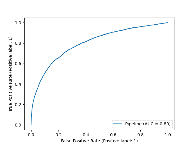
ROC AUC is a quite popular way to assess a classifier. It refers to the area under the receiver operator characteristic curve. This technique measures the false positive rate (FPR) vs. the true positive rate (TPR) at different classification thresholds. The standard classification threshold is 0.50, but in ROC AUC we vary it and measure the effect on the FPR and the TPR. We ideally want these numbers to be as far apart as possible: a high true positive rate and a low false positive rate. Calculating FPR vs. TPR at different thresholds forms the receiver operator characteristic curve. We can aggregate the difference between the two metrics from the varying thresholds into a single statistic, referred to as area under the curve (AUC).
A ROC AUC of 1 is the best possible score, whereas a ROC AUC of 0.5 corresponds to a random model, all with respect to the FPR and TPR. Using the below code, we find that the ROC AUC is 0.75 for one of our churn models. This has a useful interpretation. If we select a random churner and a random non-churner, we have about a 75% chance that our model assigns a higher probability to the churner (the exact precision of the 75% piece is a bit obfuscated by the thresholds chosen in our calculation). The ROC AUC, therefore, helps us to understand how well our predicted probabilities separate our classes, but that does not necessarily mean the probabilities are calibrated well. It more so comments on the cardinality of predictions.
We can simply use scikit-learn to find and plot and ROC AUC.
import os | |
import matplotlib.pyplot as plt | |
from sklearn.metrics import plot_roc_curve, roc_curve | |
def produce_roc_curve_plot(estimator, x_test, y_test, model_uid): | |
""" | |
Produces a ROC curve plot and saves the result locally. | |
:param estimator: estimator object | |
:param x_test: x_test dataframe | |
:param y_test: y_test series | |
:param model_uid: model uid | |
""" | |
plot_roc_curve(estimator, x_test, y_test) | |
plt.savefig(os.path.join('modeling', model_uid, 'diagnostics', 'evaluation_plots', 'roc_curve.png')) | |
plt.clf() |
The code will give us a plot that looks something like the following.
In some cases, we need to bifurcate our predictions into two classes. (Even in such a case, I would recommend relying on the calibrated probabilities to make such an estimate). One route we could take is finding the point on the ROC curve where our true positive and false positive rates are most different.
import numpy as np | |
import pandas as pd | |
import os | |
from sklearn.metrics import roc_curve | |
def find_optimal_class_cutoff(y_test, probability_predictions, model_uid): | |
""" | |
Finds the optimal class cutoff based on the ROC curve and saves the result locally. | |
:param y_test: y_test series | |
:param probability_predictions: probability predictions for the positive class | |
:param model_uid: model uid | |
:return: float that represents the optimal threshold | |
""" | |
fpr, tpr, threshold = roc_curve(y_test, probability_predictions) | |
optimal_idx = np.argmax(tpr - fpr) | |
optimal_threshold = threshold[optimal_idx] | |
best_tpr = tpr[optimal_idx] | |
best_fpr = fpr[optimal_idx] | |
df = pd.DataFrame({'optimal_threshold': [optimal_threshold], 'best_tpr': [best_tpr], 'best_fpr': [best_fpr]}) | |
df.to_csv(os.path.join('modeling', model_uid, 'diagnostics', 'evaluation_files', 'optimal_class_cutoff.csv'), | |
index=False) | |
return optimal_threshold | |
The standard class cutoff is 50%. That is, if an observation has a predicted probability over 50%, it is part of the predicted positive class. A classic data science discussion involves how sacred the 50% cutoff is. Is it arbitrary? Set in stone? Will we be struck with lighting if we change it? Conceptually, a 50% cutoff makes sense. However, when probabilities are not calibrated, a prediction of 50% does not necessarily map to a real-world probability of 50%. Please see discussion in Chapter 11. Therefore, unless we are calibrating our model, the 50% cutoff is arbitrary and will not map to our original conceptual understanding of what the cutoff should be. Under the hood, for uncalibrated models that are optimized to predict class labels, the 50% cutoff can be subjectively gamed by the model to improve performance. This is proved out by some model's having idiosyncratic probabilities. In such cases, the model has no concept of what 50% really means; more so, it is given no reward for correctly defining the 50% mark.
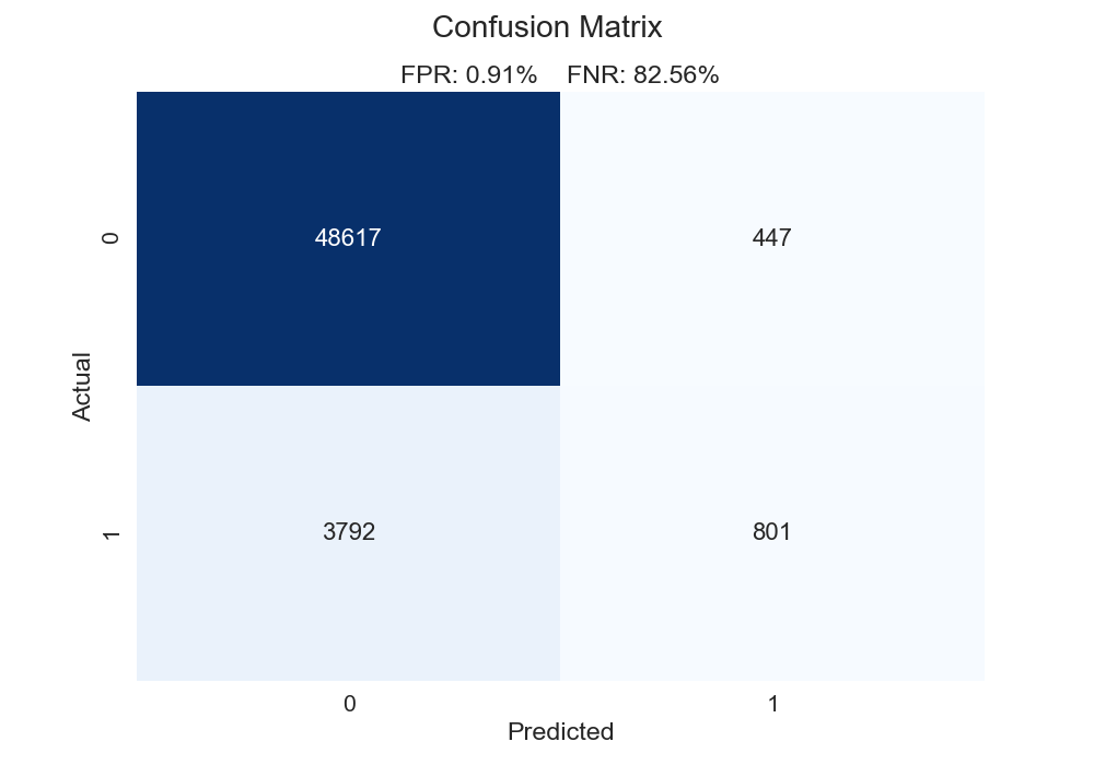
The confusion matrix is inescapable in machine learning. It charts out true positives, true negatives, false positives, and false negatives. You might have guessed the downside to the confusion matrix: it does not evaluate probabilities. That said, knowing how to review a confusion matrix is a right of data science passage. Let's first see a function we could use for creating a confusion matrix.
import pandas as pd | |
import os | |
import seaborn as sns | |
import matplotlib.pyplot as plt | |
from sklearn.metrics import confusion_matrix | |
def plot_confusion_matrix(y_test, class_predictions, model_uid): | |
""" | |
Plots a confusion matrix ans saves it locally. | |
:param y_test: y_test series | |
:param class_predictions: class predictions series | |
:param model_uid: model uid | |
""" | |
data_cm = confusion_matrix(y_test, class_predictions) | |
tn, fp, fn, tp = data_cm.ravel() | |
fpr = round((fp / (fp + tn)) * 100, 2) | |
fnr = round((fn / (fn + tp)) * 100, 2) | |
df_cm = pd.DataFrame(data_cm, columns=np.unique(y_test), index=np.unique(y_test)) | |
df_cm.index.name = 'Actual' | |
df_cm.columns.name = 'Predicted' | |
plt.figure(figsize=(10, 7)) | |
sns.set(font_scale=1.4) | |
sns.heatmap(df_cm, cmap="Blues", annot=True, annot_kws={"size": 16}, cbar=False, fmt='g') | |
plt.suptitle('Confusion Matrix') | |
plt.title(f'FPR: {fpr}% FNR: {fnr}%') | |
plt.savefig(os.path.join('modeling', model_uid, 'diagnostics', 'evaluation_plots', 'confusion_matrix.png')) | |
plt.clf() | |
For one of the models constructed in chapter 10, we get the confusion matrix below. Here is how we could summarize this chart.
In our above function, we calculate the false positive and false negative rates. The false positive rate is calculated as such: false positives / (false positives + true negatives). The denominator comprises all negative cases. The numerator represents all the cases that are negative but that we said are positive. Think of it this way: what percentage of actual negative observations are predicted incorrectly? Conversely, the false negative rate is calculated as such: false negatives / (false negatives + true positives). The denominator contains all the positive observations. The numerator has all the cases that are positive but that we said are negative. Again, think of it this way: what percentage of actual positive observations are predicted incorrectly? Our plot below illustrates that our false negative rate is way worse than our false positive rate. Give the classic 0.50 cutoff, our model struggles to find the positive cases.
What is the impact on our confusion matrix if we use the "optimal" class cutoff found in the function from the foregoing section? We can see that changing the cutoff to 7.3% (the "optimal" cutoff using the ROC AUC method) substantially lowers our false negative rate, though it does so at the expense of our false positive rate. Additionally, 7.3% may seem like a low cutoff - it is a far cry from the typical 50% mark. However, consider these facts: The overall churn rate is pretty low (~8.5%), and our model predicts most observations to have a lower than 10% probability of churning. In that light, 7.3% might make more sense that 50%. The standard 50% cutoff can often be a bit naive.
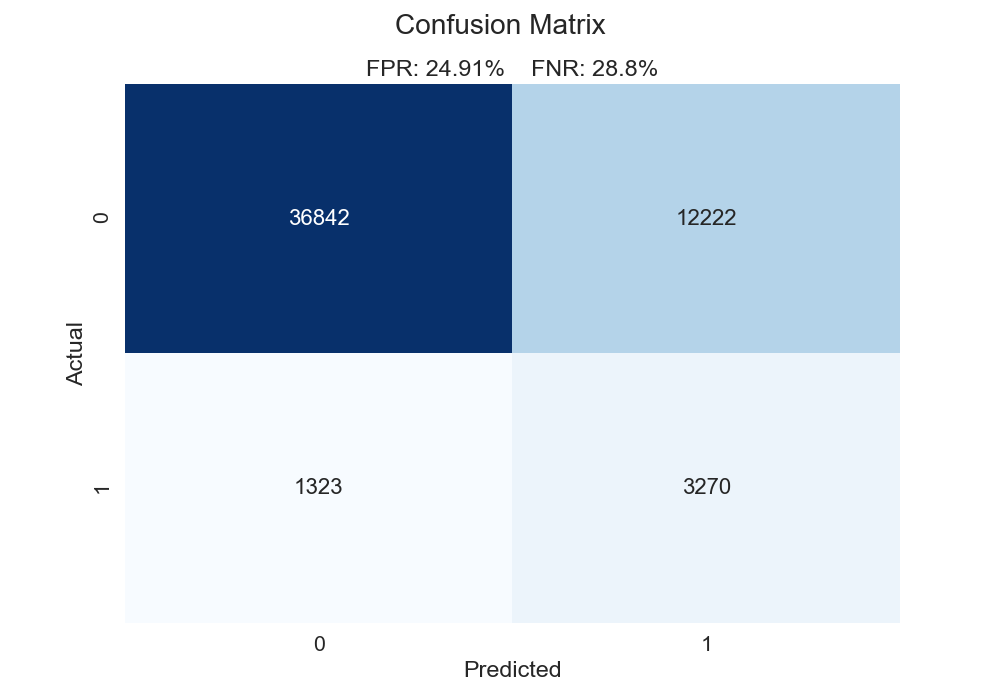
Now, a tradeoff exists between the false negative rate and the false positive rate. For instance, if we simply predicted every case to be positive, our false negative rate would be 0. However, this very likely wouldn't be wise. In fact, if we wanted to predict everything as a positive case, we don't even need machine learning for that. We need to determine what instance is more costly: a false positive or a false negative. This determination requires case-by-case evaluation. For our problem, I would posit that a false negative is more costly. In this case, we don't treat someone who is a churn risk. A false positive isn't as big of a deal; that person might get an email or a coupon, and we can stomach that (in our contrived world).
While we're talking about class labels, let's mention a few more common metrics: precision, recall, and F1 Score.
Intuitively, a tradeoff exists between precision and recall. For example, we can have perfect recall if we simply predict everything to be a positive case. However, our precision would be terrible. Conversely, if we find the one observation we are most confident is in the positive class, and that is the only observation we predict to be positive, our precision could very well be perfect but our recall would be awful. If we care about class labels, we want to balance this tradeoff.
We can calculate these metrics in scikit-learn using the following scoring functions: sklearn.metrics.recall_score, sklearn.metrics.precision_score, and sklearn.metrics.f1_score.
Precision and recall are overrated. I wish I saw them far less in data science. More or less, they are concerned about different flavors of accuracy. In the case study below, we have a "baseline" case (scenario 1) produced by run_baseline_comparision(). Scenario 2, produced by run_improved_calibration_comparison(), has the same precision, recall, and F1 score, even though our log loss improves. Our model is clearly better (i.e. we have better probabilistic estimates), but precision, recall, and F1 don't care. What's more, in scenario 3 produced by run_inverse_case_comparison(), we get better precision, recall, and F1 scores but worse calibration. Our model might seem more "accurate", but it is less "useful".
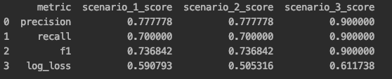
What do we mean by a "useful" model? In the final scenario, we have a pretty un-confident model. Many predictions are globbed in the middle of the distribution. We don't have any predictions the model is very confident in. This isn't reflected in metrics that only care about class labels. Since our probability space is constricted, there is a lot our model can't tell us (e.g what observations are very likely or very unlikely to be in the positive class). Let's specifically compare scenario 2 and scenario 3. The latter has better precision, recall, and F1 scores but a worse log loss. Scenario 2 is bested in 3/4 metrics, but it is definitely our best model! It produces the most interesting and actionable probability space, something that many classic evaluation metrics don't appreciate. From a business standpoint, there is great value in finding observations on the ends of the distributions These are observations we can be confident will act in a certain way (probabilistically). A glob of predictions in the middle of the distribution basically gives us a bunch of observations that have coin-flip odds. When we have a well-calibrated model that doesn't bunch up predictions, we get a meaningful and actionable distribution. We can do a lot more with our model. As we've seen, we shouldn't just care about class labels and how well those are predicted. Rather, we should understand such metrics don't necessarily communicate how useful and actionable our model is. In general, I am always willing to trade precision, recall, and F1 score for calibration. If we can map appropriate probabilities to observations, we can launch more meaningful actions.
import pandas as pd | |
import numpy as np | |
from sklearn.metrics import precision_score, recall_score, f1_score, log_loss | |
def run_baseline_comparision(): | |
df = pd.DataFrame({ | |
'actual': [0, 0, 0, 0, 0, 0, 0, 0, 0, 0, 1, 1, 1, 1, 1, 1, 1, 1, 1, 1], | |
'pred_prob': [0.30, 0.35, 0.37, 0.40, 0.41, 0.43, 0.45, 0.46, 0.51, 0.65, | |
0.55, 0.57, 0.59, 0.60, 0.62, 0.67, 0.69, 0.47, 0.43, 0.39] | |
}) | |
df['pred_class'] = np.where(df['pred_prob'] >= 0.50, 1, 0) | |
precision = precision_score(df['actual'], df['pred_class']) | |
recall = recall_score(df['actual'], df['pred_class']) | |
f1 = f1_score(df['actual'], df['pred_class']) | |
ll = log_loss(df['actual'], df['pred_prob']) | |
metrics_df = pd.DataFrame({ | |
'metric': ['precision', 'recall', 'f1', 'log_loss'], | |
'scenario_1_score': [precision, recall, f1, ll], | |
}) | |
return metrics_df | |
def run_improved_calibration_comparison(): | |
df = pd.DataFrame({ | |
'actual': [0, 0, 0, 0, 0, 0, 0, 0, 0, 0, 1, 1, 1, 1, 1, 1, 1, 1, 1, 1], | |
'pred_prob': [0.10, 0.15, 0.17, 0.30, 0.31, 0.33, 0.41, 0.46, 0.70, 0.85, | |
0.65, 0.67, 0.69, 0.75, 0.82, 0.87, 0.95, 0.48, 0.45, 0.42] | |
}) | |
df['pred_class'] = np.where(df['pred_prob'] >= 0.50, 1, 0) | |
precision = precision_score(df['actual'], df['pred_class']) | |
recall = recall_score(df['actual'], df['pred_class']) | |
f1 = f1_score(df['actual'], df['pred_class']) | |
ll = log_loss(df['actual'], df['pred_prob']) | |
metrics_df = pd.DataFrame({ | |
'metric': ['precision', 'recall', 'f1', 'log_loss'], | |
'scenario_2_score': [precision, recall, f1, ll], | |
}) | |
return metrics_df | |
def run_inverse_case_comparison(): | |
df = pd.DataFrame({ | |
'actual': [0, 0, 0, 0, 0, 0, 0, 0, 0, 0, 1, 1, 1, 1, 1, 1, 1, 1, 1, 1], | |
'pred_prob': [0.37, 0.39, 0.39, 0.44, 0.44, 0.45, 0.45, 0.48, 0.49, 0.70, | |
0.52, 0.53, 0.54, 0.55, 0.61, 0.64, 0.67, 0.53, 0.55, 0.44] | |
}) | |
df['pred_class'] = np.where(df['pred_prob'] >= 0.50, 1, 0) | |
precision = precision_score(df['actual'], df['pred_class']) | |
recall = recall_score(df['actual'], df['pred_class']) | |
f1 = f1_score(df['actual'], df['pred_class']) | |
ll = log_loss(df['actual'], df['pred_prob']) | |
metrics_df = pd.DataFrame({ | |
'metric': ['precision', 'recall', 'f1', 'log_loss'], | |
'scenario_3_score': [precision, recall, f1, ll], | |
}) | |
return metrics_df | |
def main(): | |
baseline_scores_df = run_baseline_comparision() | |
improved_calibration_df = run_improved_calibration_comparison() | |
inverse_case_df = run_inverse_case_comparison() | |
metrics_df = pd.merge(baseline_scores_df, improved_calibration_df, how='inner', on='metric') | |
metrics_df = pd.merge(metrics_df, inverse_case_df, how='inner', on='metric') | |
return metrics_df | |
if __name__ == "__main__": | |
comparison_metrics_df = main() | |
print(comparison_metrics_df) |
The concordant–discordant ratio pairs every observation that is positive with every observation that is negative. For each pair, we then compare the probabilities. If the positive observation has a higher predicted probability, the observation is concordant. If the positive observation has a lower predicted probability, the observation is discordant. We obviously want a high ratio of concordant cases to discordant cases. This metric tells us that, if we take a random positive observation and a random negative observation, what the probability is that the positive observation's predicted probability is higher. As you might have connected, this is very much related to the concept of ROC AUC. However, keep in mind this does not necessarily mean the predictions were calibrated correctly or met some desired threshold. This metric only comments on cardinality and general class separation.
Related is Somer's D. This is calculated as such: (Concordant Pairs - Discordant Pairs) / Total Pairs. If we have perfect agreement (positive cases always have greater predictions), the statistic will be 1. If we have perfect disagreement (positive cases never gave greater predictions), the statistic will be -1. More or less, this transforms our concordant–discordant ratio into a different scale.
import pandas as pd | |
import itertools | |
import multiprocessing as mp | |
import os | |
def _assemble_negative_and_positive_pairs(y_test, probability_predictions, subset_percentage=0.1): | |
""" | |
Finds the combination of every predicted probability in the negative class and every predicted probability in the | |
positive class. | |
:param y_test: y_test series | |
:param probability_predictions: positive probability predictions series | |
:param subset_percentage: percentage of observations to keep, as finding all the the combinations of positive and | |
negative can result in a combinatorial explosion; default is 0.1 | |
:returns: list | |
""" | |
df = pd.concat([y_test, probability_predictions], axis=1) | |
df = df.sample(frac=subset_percentage) | |
columns = list(df) | |
true_label = columns[0] | |
predicted_prob = columns[1] | |
neg_df = df.loc[df[true_label] == 0] | |
neg_probs = neg_df[predicted_prob].tolist() | |
pos_df = df.loc[df[true_label] == 1] | |
pos_probs = pos_df[predicted_prob].tolist() | |
return list(itertools.product(neg_probs, pos_probs)) | |
def _find_discordants(pairs): | |
""" | |
Finds the number of discordants, defined as the number of cases where predicted probability in\\of the negative | |
class observation is greater than the predicted probability of the positive class observation. | |
:param pairs: tuple where the first element is the negative probability and the second element is the positive | |
probability | |
:returns: integer | |
""" | |
discordants = 0 | |
if pairs[0] >= pairs[1]: | |
discordants += 1 | |
return discordants | |
def find_concordant_discordant_ratio_and_somers_d(y_test, probability_predictions, model_uid): | |
""" | |
Finds the concordant-discordant ratiio and Somer's D and saved them locally | |
:param y_test: y_test series | |
:param probability_predictions: positive probability predictions series | |
:param model_uid: model uid | |
""" | |
pairs = _assemble_negative_and_positive_pairs(y_test, probability_predictions) | |
with mp.Pool(processes=mp.cpu_count()) as pool: | |
result = pool.map(_find_discordants, pairs) | |
pairs = len(result) | |
discordant_pairs = sum(result) | |
concordant_discordant_ratio = 1 - (discordant_pairs / pairs) | |
concordant_pairs = pairs - discordant_pairs | |
somers_d = (concordant_pairs - discordant_pairs) / pairs | |
pd.DataFrame({'concordant_discordant_ratio': [concordant_discordant_ratio], 'somers_d': [somers_d]}).to_csv( | |
os.path.join('modeling', model_uid, 'diagnostics', 'evaluation_files', 'concordant_discordant.csv'), | |
index=False) |
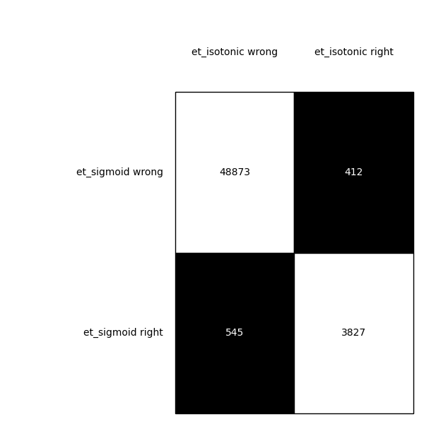
McNemar's Test allows us to see if there is a statistically significant difference in models. Cochran's Q Test extends this idea to the comparison of multiple models. The null hypothesis is that the models have equal performance. If the p-value is below 0.05, we can reject the null hypothesis and state the models have different performance. We can also get a nice contingency plot of the predictions of our models.
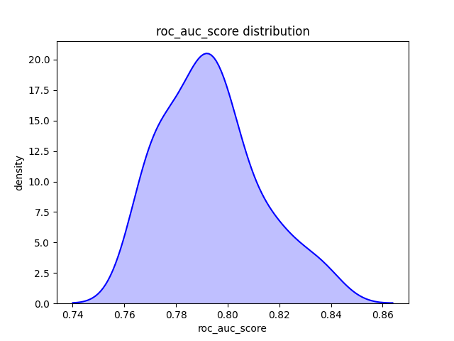
import pandas as pd | |
import os | |
import matplotlib.pyplot as plt | |
from mlxtend.evaluate import mcnemar, mcnemar_table | |
from mlxtend.plotting import checkerboard_plot | |
def run_mcnemar_test(y_test, model_1_class_predictions, model_2_class_predictions, model_1_name, model_2_name): | |
""" | |
Runs the McNemar test to determine if there is a statistically significant difference in the class predictions. | |
Writes the results and associated contingency table locally. | |
:param y_test: y_test series | |
:param model_1_class_predictions: class predictions from model 1 | |
:param model_2_class_predictions: class predictions from model 2 | |
:param model_1_name: name of the first model | |
:param model_2_name: name of the second model | |
""" | |
results_table = mcnemar_table(y_target=y_test, y_model1=model_1_class_predictions, | |
y_model2=model_2_class_predictions) | |
chi2, p = mcnemar(ary=results_table, corrected=True) | |
pd.DataFrame({'chi2': [chi2], 'p': [p]}).to_csv(os.path.join(f'{model_1_name}_{model_2_name}_mcnemar_test.csv')) | |
board = checkerboard_plot(results_table, | |
figsize=(6, 6), | |
fmt='%d', | |
col_labels=[f'{model_2_name} wrong', f'{model_2_name} right'], | |
row_labels=[f'{model_1_name} wrong', f'{model_1_name} right']) | |
plt.tight_layout() | |
plt.savefig(os.path.join('modeling', 'comparison_files', f'{model_1_name}_{model_2_name}_mcnemar_test.png')) | |
plt.clf() |
import pandas as pd | |
import os | |
from mlxtend.evaluate import cochrans_q | |
def run_cochran_q_test(y_test, *model_predictions, output_name): | |
""" | |
Runs Cochran's Q test to determine if there is a statistically significant difference in more than two models' class | |
predictions. The function can support up to five sets of predictions. Results are saved locally. | |
:param y_test: y_test series | |
:param model_predictions: arbitrary number of model predictions | |
:param output_name: name to append to file to identify models used in the test | |
""" | |
n_models = len(model_predictions) | |
if n_models == 3: | |
chi2, p = cochrans_q(y_test.values, model_predictions[0].values, model_predictions[1].values, | |
model_predictions[2].values) | |
elif n_models == 4: | |
chi2, p = cochrans_q(y_test.values, model_predictions[0].values, model_predictions[1].values, | |
model_predictions[2].values, model_predictions[3].values) | |
elif n_models == 5: | |
chi2, p = cochrans_q(y_test.values, model_predictions[0].values, model_predictions[1].values, | |
model_predictions[2].values, model_predictions[3].values, model_predictions[4].values) | |
else: | |
raise Exception('function cannot support more than five sets of predictions') | |
pd.DataFrame({'chi2': [chi2], 'p': [p]}).to_csv(os.path.join('modeling', 'comparison_files', | |
f'{output_name}_cochrans_q_test.csv')) | |
For the foregoing metrics, we are taking a single calculation on our entire test set. However, we might want to take random subsets of our test set and calculate the metric of interest on each subset. Doing so will allow us to understand, at least partially, the distribution of results. The results on our test set are affected by randomness. After all, we take a random percentage of observations and assign them to our test set. We might simply get a bit lucky on our split. For instance, our test set might have a collection of easy-to-predict cases. If we shard our test set, we break up (hopefully) this collection and might get a more realistic picture of our model's ability to generalize.
Using one of our models from chapter 10, we get a ROC AUC of 0.799 on our entire test set. Not bad. By using the below function, we get a very similar mean ROC AUC, but we now see a fuller picture of the range we might expect.
import pandas as pd | |
import os | |
import seaborn as sns | |
import matplotlib.pyplot as plt | |
def get_bootstrap_estimate(y_test, prediction_series, scoring_metric, metric_name, model_uid, samples=30): | |
""" | |
Produces a bootstrap estimate for a scoring metric. y_test and it's associated predictions are sampled with | |
replacement. The samples argument dictates how many times to perform each sampling. Each sample is of equal length, | |
determined by len(y_test) / samples. Summary statistics and a density plot of the distribution are saved locally. | |
:param y_test: y_test series | |
:param prediction_series: relevant prediction series | |
:param scoring_metric: scikit-learn scoring metric callable (e.g. roc_auc_score) | |
:param metric_name: string name of the metric | |
:param model_uid: model uid | |
:param samples: number of samples to take; default is 30 | |
""" | |
y_test = y_test.reset_index(drop=True) | |
prediction_series = prediction_series.reset_index(drop=True) | |
df = pd.concat([y_test, prediction_series], axis=1) | |
approx_sample_size = int(len(df) / samples) | |
metrics_df = pd.DataFrame() | |
for sample in range(samples): | |
temp_df = df.sample(n=approx_sample_size) | |
try: | |
score = scoring_metric(temp_df.iloc[:, 0], temp_df.iloc[:, 1], labels=[0, 1]) | |
except: | |
score = scoring_metric(temp_df.iloc[:, 0], temp_df.iloc[:, 1]) | |
temp_df = pd.DataFrame({'score': [score]}) | |
metrics_df = metrics_df.append(temp_df) | |
described_df = metrics_df.describe() | |
described_df.to_csv(os.path.join('modeling', model_uid, 'diagnostics', 'evaluation_files', | |
f'{metric_name}_sample_scores.csv')) | |
sns.kdeplot(metrics_df['score'], shade=True, color='b', legend=False) | |
plt.xlabel(metric_name) | |
plt.ylabel('density') | |
plt.title(f'{metric_name} distribution') | |
plt.savefig(os.path.join('modeling', model_uid, 'diagnostics', 'evaluation_plots', | |
f'{metric_name}_density_plot.png')) | |
plt.clf() | |
The classic lift metric keys off our confusion matrix. It answers the question: How much lift does our model provide over a baseline of simply predicting at random with respect to our class balance? (For our project, our baseline model would be randomly assign 8.6% of observations to our positive class). For example, a lift value of 2 would correspond to a model is twice as effective as a random model.
import pandas as pd | |
import os | |
from mlxtend.evaluate import lift_score | |
def calculate_class_lift(y_test, class_predictions, model_uid): | |
""" | |
Calculates the lift of a model, based on predicted class labels. | |
:param y_test: y_test series | |
:param class_predictions: class predictions series | |
:param model_uid: model uid | |
""" | |
lift = lift_score(y_test, class_predictions) | |
pd.DataFrame({'lift': [lift]}).to_csv(os.path.join('modeling', model_uid, 'diagnostics', 'evaluation_plots', | |
'class_lift.csv'), index=False) | |
We can extend this idea to probabilities. That is, what lift do we get from our model over assuming that every customer has an 8.6% probability of churning? This will also help to assess our calibration. The function below performs this calculation. The docstring explains the mechanics of the process. Remember the quantile calibration plots from chapter 11? More or less, we are trying to put a number of how good a quantile plot is.
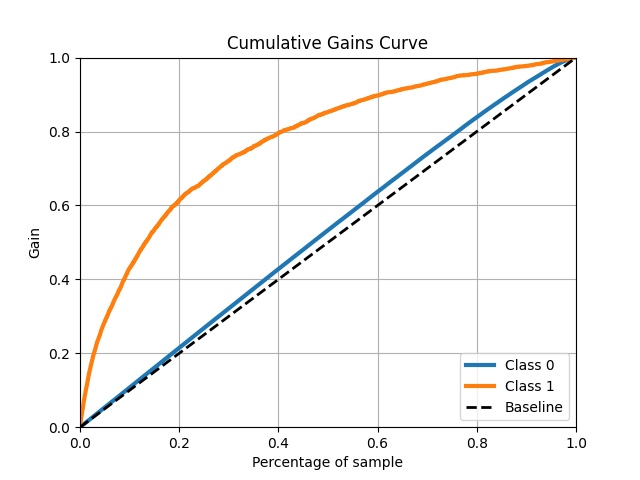
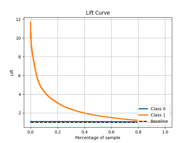
import pandas as pd | |
import os | |
def calculate_probability_lift(y_test, probability_predictions, model_uid, n_bins=10): | |
""" | |
Calculates the lift provided by the probability estimates. Lift is determined by how much improvement is experienced | |
by using the predicted probabilities over assuming that each observation has the same probability of being in the | |
positive class (i.e. applying the overall rate of occurrence of the positive class to all observations). | |
This process takes the following steps: | |
- find the overall rate of occurrence of the positive class | |
- cut the probability estimates into n_bins | |
- for each bin, calculate: | |
- the average predicted probability | |
- the actual probability | |
- for each bin, calculate | |
- the difference between the average predicted probability and the true probability | |
- the difference between the overall rate of occurrence and the true probability | |
- take the sum of the absolute value for each the differences calculated in the previous step | |
- take the ratio of the two sums, with the base rate sum as the numerator | |
Values above 1 indicate the predicted probabilities have lift over simply assuming each observation has the same | |
probability. | |
:param y_test: y_test series | |
:param probability_predictions: positive probability predictions series | |
:param model_uid: model uid | |
:param n_bins: number of bins to segment the probability predictions | |
""" | |
y_test = y_test.reset_index(drop=True) | |
prediction_series = probability_predictions.reset_index(drop=True) | |
df = pd.concat([y_test, prediction_series], axis=1) | |
columns = list(df) | |
class_col = columns[0] | |
proba_col = columns[1] | |
base_rate = df[class_col].mean() | |
df['1_prob_bin'] = pd.qcut(df[proba_col], q=n_bins, labels=list(range(1, n_bins + 1))) | |
grouped_df = df.groupby('1_prob_bin').agg({proba_col: 'mean', class_col: 'mean'}) | |
grouped_df.reset_index(inplace=True) | |
grouped_df['1_prob_diff'] = grouped_df[proba_col] - grouped_df[class_col] | |
grouped_df['base_rate_diff'] = base_rate - grouped_df[class_col] | |
prob_diff = grouped_df['1_prob_diff'].abs().sum() | |
base_rate_diff = grouped_df['base_rate_diff'].abs().sum() | |
lift = base_rate_diff / prob_diff | |
pd.DataFrame({'lift': [lift]}).to_csv(os.path.join('modeling', model_uid, 'diagnostics', 'evaluation_files', | |
'proba_lift.csv'), index=False) |
We can also visualize class lift with lift curves and cumulative gains charts.
The cumulative gains chart tells us how much we "gain", in a certain light, by using a predictive model. In this chart, we take our predicted probabilities and sort them from highest to lowest (e.g. the top 10% of observations would be the 10% with the highest predicted probabilities). Next to each predicted probability is the actual class. For every incremental observation (i.e. increase in the percentage of observations), we can assess how many positive cases we have detected overall. The dashed baseline represents a random model. For example, using a random model that assigns a static probability to all cases, if we select the top 40% of our samples, we would expect to detect 40% of the positive cases. On average, we'll always have about this ratio. However, by using our predictive model, if we select the top 40% of our samples, we will expect to detect about 80% of the positive cases. The cumulative gain chart does not really assess our calibration but rather the cardinality of predictions. It helps to show if our model places higher probabilities on observations actually in the positive class. The highest prediction bins should have much higher detection rates.
import os | |
import matplotlib.pyplot as plt | |
import scikitplot as skplt | |
def plot_cumulative_gains_chart(y_test, probability_predictions, model_uid): | |
""" | |
Produces a cumulative gains chart and saves it locally. | |
:param y_test: y_test series | |
:param probability_predictions: dataframe of probability predictions, with the first column being the negative | |
class predictions and the second column being the positive class predictions | |
:param model_uid: model uid | |
""" | |
skplt.metrics.plot_cumulative_gain(y_test, probability_predictions) | |
plt.savefig(os.path.join('modeling', model_uid, 'diagnostics', 'evaluation_plots', 'cumulative_gains_plot.png')) | |
plt.clf() | |
The lift curve is closely related. It communicates the same learnings as the gains chart but in a slightly different way. The lift curve displays the actual lift. For example, at 40% of our ordered sample, we get a 2x lift. This can be verified with what we see in the gains chart. With our top 40% of predicted probabilities, we can detect 80% of the actual positive cases. Again, this provides commentary on cardinality but not calibration.
import os | |
import matplotlib.pyplot as plt | |
import scikitplot as skplt | |
def plot_lift_curve_chart(y_test, probability_predictions, model_uid): | |
""" | |
Produces a lif curve and saves it locally. | |
:param y_test: y_test series | |
:param probability_predictions: dataframe of probability predictions, with the first column being the negative | |
class predictions and the second column being the positive class predictions | |
:param model_uid: model uid | |
""" | |
skplt.metrics.plot_lift_curve(y_test, probability_predictions) | |
plt.savefig(os.path.join('modeling', model_uid, 'diagnostics', 'evaluation_plots', 'lift_curve.png')) | |
plt.clf() | |
Though we've partially seen it, we might also benefit from expressly plotting the distribution of our positive predictions. This doesn't speak to calibration but can help us understand how our model behaves.
import seaborn as sns | |
import matplotlib.pyplot as plt | |
def plot_distribution_of_positive_predictions(model_uid, positive_predictions_series): | |
""" | |
Makes a density plot of the positive predictions. | |
:param model_uid: model uid | |
:param positive_predictions_series: series of positive predictions | |
""" | |
sns.kdeplot(positive_predictions_series, shade=True, color='b', legend=False) | |
plt.xlabel('positive prediction space') | |
plt.ylabel('density') | |
plt.title('Positive Predictions Distribution') | |
plt.savefig(os.path.join('modeling', model_uid, 'diagnostics', 'evaluation_plots', 'pos_prediction_distribution.png')) | |
plt.clf() |
The Kolmogorov Smirnov Test tells us if two distributions have a statistically significant difference. In other words, are observations drawn from the same distribution? This can help us assess if our model predicts different probability distributions for actual positive and negative cases. More or less, it measures degree of separation. A higher KS statistic means greater separation in the distribution. However, the results do not necessarily indicate the model is good but rather if the model produces distinct prediction spaces based on the actual label. That said, the two are often correlated. If the p-value is below our desired threshold (often 0.05), then we can say the distributions are drawn from different distributions.
import pandas as pd | |
import os | |
import matplotlib.pyplot as plt | |
import scikitplot as skplt | |
def produce_ks_statistic(y_test, probability_predictions, model_uid): | |
""" | |
Calculates the K-S statistic and saves the results locally. | |
:param y_test: y_test series | |
:param probability_predictions: dataframe of probability predictions, with the first column being the negative | |
class predictions and the second column being the positive class predictions | |
:param model_uid: model uid | |
""" | |
df = pd.concat([y_test, probability_predictions], axis=1) | |
columns = list(df) | |
true_label = columns[0] | |
pos_predicted_prob = columns[1] | |
pos_df = df.loc[df[true_label] == 1] | |
neg_df = df.loc[df[true_label] == 0] | |
result = ks_2samp(pos_df[pos_predicted_prob], neg_df[pos_predicted_prob]) | |
pd.DataFrame({'ks_statistic': [result[0]], 'p_value': [result[1]]}).to_csv( | |
os.path.join('modeling', model_uid, 'diagnostics', 'evaluation_files', 'ks_statistics.csv'), index=False) | |
skplt.metrics.plot_ks_statistic(y_test, probability_predictions) | |
plt.savefig(os.path.join('modeling', model_uid, 'diagnostics', 'evaluation_plots', 'ks_statistic.png')) | |
plt.clf() | |
When building machine learning models, we can either underfit or overfit our model. If we underfit our model, we are building a model that is too conservative. It is relying on rules that are too simple to capture the true nature of the variation in the data. This scenario is called bias - the model is systemically biased toward a simplistic view of the data. Overfitting our model is the opposite. In this case, our model captures both signal and noise. We are fitting a function that is too complex for the data at hand. This situation is called variance - the model is highly sensitive to the input data, and the predictions can vary greatly even with mild changes in the inputs. We can decompose bias and variance with the following code. To note, the current methodologies for decomposing the bias and variance of classification models is not perfect. That said, the below implementation can still be instructive.
import pandas as pd | |
import os | |
from mlxtend.evaluate import bias_variance_decomp | |
def perform_bias_variance_decomposition(estimator, x_train, y_train, x_test, y_test, model_uid, n_boostraps=20): | |
""" | |
Decomposes the average loss of a model into bias and variance. Writes out the results locally. | |
:param estimator: estimator object | |
:param x_train: x_train | |
:param y_train: y_train | |
:param x_test: x_test | |
:param y_test: y_test | |
:param n_boostraps: number of bootstrap samples to take | |
:param model_uid: model uid | |
""" | |
x_train = x_train.reset_index(drop=True) | |
y_train = y_train.reset_index(drop=True) | |
x_test = x_test.reset_index(drop=True) | |
y_test = y_test.reset_index(drop=True) | |
avg_expected_loss, avg_bias, avg_var = bias_variance_decomp(estimator, x_train, y_train, x_test, y_test, | |
loss='0-1_loss', random_seed=1234, | |
num_rounds=n_boostraps) | |
pd.DataFrame({'avg_expected_loss': [avg_expected_loss], 'avg_bias': [avg_bias], 'avg_var': [avg_var]}).to_csv( | |
os.path.join('modeling', model_uid, 'diagnostics', 'evaluation_files', f'bias_variance_decomposition.csv'), | |
index=False) | |
A couple of points are worth noting. First, this methodology can be computationally expensive as it refits our model to different bootstrap samples of the data. You can speed up the code by lowering the number of bootstrap samples and / or by simply limiting the size of your data. Second, the mlxtend implementation does not work if your data is in a dataframe - the bootstrap sampling portion fails. Our modeling pipeline, by contrast, expects a dataframe as we expressly mention feature names. Therefore, we need to adjust the source code of mlxtend. As we have mentioned in previous chapters, updating library source code can be risky as our change could have unintended consequences. After all, we did not write the library and are not experts on it. That said, we need to change the first function in bias_variance_decomp.py to be the following:
def _draw_bootstrap_sample(rng, X, y):
"""
For this change: https://opensource.org/licenses/BSD-3-Clause
"""
sample_indices = np.arange(X.shape[0])
bootstrap_indices = rng.choice(sample_indices,
size=sample_indices.shape[0],
replace=True)
if isinstance(X, np.ndarray):
return X[bootstrap_indices], y[bootstrap_indices]
else:
return X.iloc[bootstrap_indices], y.iloc[bootstrap_indices]
Thus far, we have discussed out-of-the-box evaluation metrics. However, scikit-learn gives us the ability to create our own evaluation metrics. Pretty sweet. The below is an implementation of a custom scorer that mixes brier score and log loss, two metrics we reviewed in chapter 11. Recall the brier score provided comparatively more penalization for small errors, while log loss provided comparatively more penalization for large errors. The below implementation is not super scientific, but it does attempt to mix the two metrics to play to their "strengths" (i.e. we really want to penalize wrong predictions judged by their probabilities).
First, let's add helpers/custom_scorers.py.
import numpy as np | |
import pandas as pd | |
from sklearn.metrics import brier_score_loss, log_loss | |
def calculate_log_loss_brier_score_mix(y_true, y_pred): | |
""" | |
Calculates a weighted average of brier score and log loss. Log loss is applied for predictions off by greater | |
than 0.5; otherwise, the brier score is applied. | |
:param y_true: true labels | |
:param y_pred: predicted positive probabilities | |
""" | |
y_true = y_true.to_frame() | |
y_true = y_true.reset_index(drop=True) | |
y_true.columns = ['y_true'] | |
if isinstance(y_pred, np.ndarray): | |
y_pred = pd.DataFrame(y_pred, columns=['y_pred']) | |
else: | |
y_pred = y_pred.to_frame() | |
y_pred.columns = ['y_pred'] | |
y_pred = y_pred.reset_index(drop=True) | |
temp_df = pd.concat([y_true, y_pred], axis=1) | |
temp_df['abs_diff'] = abs(temp_df['y_true'] - temp_df['y_pred']) | |
below_cutoff_df = temp_df.loc[temp_df['abs_diff'] <= 0.5] | |
above_cutoff_df = temp_df.loc[temp_df['abs_diff'] > 0.5] | |
brier_score = brier_score_loss(below_cutoff_df['y_true'], below_cutoff_df['y_pred']) | |
log_loss_score = log_loss(above_cutoff_df['y_true'], above_cutoff_df['y_pred'], labels=[0, 1]) | |
score = (brier_score * (len(below_cutoff_df) / len(temp_df))) + \ | |
(log_loss_score * (len(above_cutoff_df) / len(temp_df))) | |
return score |
In modeling/config.py, we need to import make_scorer.
from sklearn.metrics import log_loss, f1_score, roc_auc_score, brier_score_loss, make_scorer
We can then change our CV_SCORER global variable to be the following.
CV_SCORER = make_scorer(calculate_log_loss_brier_score_mix,
greater_is_better=False,
needs_proba=True)
Likewise, we can run this metric on our test set by just adding it to the MODEL_EVALUATION_LIST.
evaluation_named_tuple(evaluation_column='1_prob', scorer_callable=calculate_log_loss_brier_score_mix,
metric_name='log_loss_brier_score_mix')
In the section about lift, we discussed comparing our model to a baseline. For our churn project, a baseline model might involve simply assuming that every observation has an 8.6% of churning. However, we might also want to compare our model against a heuristic. For example, our organization might believe that users with low activity might be more likely to churn. (Of note, summing the dummy columns in the heuristic model below should be a wash). Such rules of thumb might even be how potential churners are identified and treated currently. We can encode such a heuristic into a scikit-learn model and compare it with our actual machine learning model. Below is an implementation of a custom scikit-learn model that we can use like any other model.
import numpy as np | |
from sklearn.base import BaseEstimator, ClassifierMixin | |
from sklearn.metrics import accuracy_score | |
from sklearn.utils.validation import check_X_y, check_array | |
class HeuristicClassifier(BaseEstimator, ClassifierMixin): | |
""" | |
Models the outcome as a function of the row sum. The higher the row sum, the higher the probability of being in | |
the positive class. The probabilities are throttled by the max parameter. Increasing this parameter will lower | |
the probabilities and make the model more conservative and fewer positive cases would be predicted. | |
""" | |
def __init__(self, maximum=250): | |
self.maximum = maximum | |
self.min = 0 | |
def fit(self, X, y=None): | |
""" | |
No fit is required for this model. We simply check data here. | |
""" | |
assert (type(self.maximum) == int), 'max parameter must be integer' | |
X = check_array(X) | |
X, y = check_X_y(X, y) | |
return self | |
@staticmethod | |
def _calculate_row_sum(X): | |
""" | |
Calculates the sum of the row. | |
""" | |
return X.sum(axis=1) | |
@staticmethod | |
def _create_proba(sum_array, max): | |
""" | |
Maps an array into a probability, based on the maximum parameter. | |
""" | |
proba = sum_array / max | |
proba = np.clip(proba, 0.0001, 0.9999) | |
return proba | |
def predict(self, X, y=None): | |
""" | |
Converts probability estimates into a 0-1 classification, based on a 0.50 threshold. | |
""" | |
X = check_array(X) | |
sum_array = self._calculate_row_sum(X) | |
proba = self._create_proba(sum_array, self.maximum) | |
return np.digitize(proba, np.array([0.50, 1.0])) | |
def predict_proba(self, X, y=None): | |
""" | |
Returns predicted probabilities. | |
""" | |
X = check_array(X) | |
sum_array = self._calculate_row_sum(X) | |
proba = self._create_proba(sum_array, self.maximum) | |
return np.array([1 - proba, proba]).T | |
def score(self, X, y, sample_weight=None): | |
""" | |
Supplies the accuracy of the model | |
""" | |
return accuracy_score(y, self.predict(X)) |
Additionally, we can use a dummy model provided by scikit-learn to provide a naive baseline. The default strategy, called prior, always predicts the class that is most frequent and returns the class prior as the predicted probability. In our case, the dummy model would always predict no churn and a positive probability of ~0.086. Let's walk through what it would look like to implement both of these "dumb" models.
Due to how we have our repo structured, we only have to update modeling/config. The below is what our parameter grids and models dictionary should look like. Other elements can stay as they are.
from collections import namedtuple | |
from hyperopt import hp | |
from sklearn.dummy import DummyClassifier | |
from modeling.custom_models import HeuristicClassifier | |
ENGINEERING_PARAM_GRID = { | |
'preprocessor__numeric_transformer__log_creator__take_log': hp.choice( | |
'preprocessor__numeric_transformer__log_creator__take_log', ['yes']), | |
'preprocessor__categorical_transformer__category_combiner__combine_categories': hp.choice( | |
'preprocessor__categorical_transformer__category_combiner__combine_categories', ['yes']), | |
'preprocessor__categorical_transformer__feature_selector__percentile': hp.uniformint( | |
'preprocessor__categorical_transformer__feature_selector__percentile', [100]), | |
'preprocessor__numeric_transformer__feature_selector__percentile': hp.uniformint( | |
'preprocessor__numeric_transformer__feature_selector__percentile', [100]), | |
} | |
HEURISTIC_MODEL_PARAM_GRID = { | |
'model__maximum': hp.uniformint('model__maximum', (1, 10)) | |
} | |
DUMMY_MODEL_PARAM_GRID = { | |
} | |
model_named_tuple = namedtuple('model_config', {'model_name', 'model', 'param_space', 'iterations'}) | |
MODEL_TRAINING_LIST = [ | |
model_named_tuple(model_name='dummy', model=DummyClassifier(), param_space=DUMMY_MODEL_PARAM_GRID, iterations=1), | |
model_named_tuple(model_name='heuristic', model=HeuristicClassifier(), param_space=HEURISTIC_MODEL_PARAM_GRID, | |
iterations=10), | |
] |
What do we learn? Well, neither model is very good. Our heuristic model is particularly bad! We clearly see the benefit of leveraging machine learning over some heuristic or assuming a base rate for all cases. One additional, important point: the log loss on these models is actually not in a different ballpark compared to our "real" models. Our real models produce log loss scores on our test set of around 0.23. For the dummy models, the test set log loss is around 0.30. Looking at a single metric can be misleading. These dummy models have many, many deficiencies that we don't get by just looking at log loss. We can see the model is definitely worse based solely on the log loss score, but we miss nuance. For example, the dummy model always predicts a single probability value. This is a major drawback. This leads to another point: the log loss metric can be "gamed" a bit by simply predicting the positive class prior in all cases. We can sometimes get a decent score simply by doing this, though a "real" model should provide clear lift in log loss and other dimensions.