Chapter Introduction: Data Exploration
Alright, we have our data. What now? We should explore our data with the goals of 1) finding flaws, 2) identifying variables that should be removed, and 3) developing intuition for what features might be most important. Our two main tactics are to produce diagnostics about our data and to create visualizations, the main topics of this chapter.
Data exploration should be focused, centering on the goals identified above. Exploring the data without much intention is tempting; I’ll make some plots...run summary statistics...and I might find something notable along the way. We should work to answer specific questions in the data exploration phase because I submit that we don’t want to make too many decisions based on this work. We want to certainly add and subtract features based on our exploration. That said, algorithms can do some things well that humans can't. See the discussion in chapter 3 about model-free and model-based approaches for more details.
Visualizations and diagnostics provide a fairly limited view of our data. Human beings are fallible; we tend to jump to conclusions, find patterns when none exist, and struggle with understanding non-linearities. If we make a bunch of modeling decisions based on our exploration, we’re almost bound to make the wrong decision at some point. My preference is to let the modeling pipeline largely pinpoint features that are predictive and ones that are not. In fact, we can tune the knobs of the modeling pipeline to essentially ignore features that aren’t predictive; we don’t have to solely make the feature selection decisions on our own. We want to partner with our modeling pipeline for our feature selection and data cleaning. Human intuition and expert opinions certainly play an important and necessary role, particularly when it comes to feature engineering, that is, creating new features that our raw data does not natively have. We should make decisions about our data to help guide our model based on subject-matter knowledge. However, we must also be humble and realize that an algorithm can very likely do a better job at picking up non-linear, complex interactions among features than us humans. Again, it's teamwork.
Data exploration should heavily be used to guide our data cleaning. What features appear to have bad data? Which ones need substantial clean-up? Which variables should obviously be eliminated? What features might need transformation? Secondarily, exploration should help us anticipate model behavior. For example, we might see that XYZ is highly correlated with our target. This knowledge can be useful to validate if the model’s behavior aligns with our initial impressions. Likewise, if we see few strong predictors during our exploration work, that will properly temper our expectations. Thirdly, our exploration should help spark ideas for features to engineer from existing data. By seeing our data and being curious, we might be able to create new, useful features that aid our predictive power.
Keep in mind the main audience for your work in this phase of the data science pipeline: you. The data exploration phase is to help youmake decisions about your data. Yes, you can easily gussy up your work to present initial findings to your boss, but that is not your main purpose here. You don’t need to get bogged down by having perfect-looking charts. In fact, that would likely be counterproductive as it would needlessly slow down your work.
Connection vs. Correlation
One reason that models are often better than visualizations for selecting features relates to the distinction between correlation and connection. Correlation refers to a linear relationship between variables; making plots to inspect correlation is easy. However, some features might be highly connected but not highly correlated (using the classic definition of correlation being a linear phenomenon). That is, they might have a strong nonlinear relationship. This is slightly more difficult to capture visually but certainly still possible. That being said, eyeballing nuanced nonlinearities can be difficult and time-consuming, especially when we have a large number of features.
Where visualizations become tricky is when features are predictive when they interact with each other. That is, B is predictive at Level X only when C is between Levels Z and Y. Again, connection but not necessarily classic correlation. We care about these nuances because we care about eking out every ounce of predictive performance. For most projects, making plots of all possible feature combination is intractable and frankly not necessary when we can have our modeling pipeline do the heavy lifting. We could brainstorm feature combinations we want to explore; however, we must remember that we could be injecting bias into our process. Why did we choose XYZ and not ABC? Did our biases play a role? Using subject matter expertise can often be a wise choice in guiding our model to certain features. That said, we must remember how our perspectives could be biased and how that could cause issues. It's a balance between human and machine. One side should not completely rule over the other.
Again, we should explore our data thoroughly. We’ll discuss how to do so below. But, making sweeping decisions from visualizations alone can be fraught with issues if we're not careful.
We’ll be inserting code into the following file: utilities/explore.py. There is some repeated code in this file, though this was an intentional choice. For instance, we impute missing values in multiple functions. Though a bit repetitious, it allows us to simply throw our raw data into the functions individually without worrying about anything else. I purposefully want these functions to be independent and not rely on anything else. Our full explore.py file is below.
Mindset Reminder: Spotting Data Quality Issues and Gaining Intuition on Model Performance
We are first going to throw our raw data into our exploration functions without any cleaning or preprocessing. Part of the purpose of exploration is to spot issues with our data and determine how we need to wrangle it. Recall the data science pipeline is recursive. After we explore, we have a better idea of how to wrangle. After we wrangle our data, we will want to go back and explore it. To make an obvious statement, we should fix data quality issues before training statistical models. Poor data quality will degrade the model’s predictive power.
As we've already discussed, throughout this process we should work to gain an intuitive understanding of how our model might perform. Are we able to eyeball any signal in the data? What features do we think might be predictive? Having this intuition will allow us to more accurately identify if something has gone awry with our model. For example, if during exploration we saw a feature that appeared to be highly connected to the target, but its feature importance score from our fitted model is comparatively low, our radars should go off. We should investigate if we have injected a bug into our modeling code.
Looking at Our Raw Data
As simple as it sounds, an effective exploration tool is simply to look at our raw data in some type of client (e.g. Excel, Numbers, Google Sheets). If we are dealing with massive amounts of data, we might need to sample our data, which will somewhat reduce the effectiveness of this exercise, though it will still likely be fruitful. By looking at the raw data with our eyes, we can potentially quickly find some obvious issues with the purity of the data. For instance, in our churn dataset, I can see that we will want to remove the customer_id column. Likewise, if we want to explore the acquired_date field, we will need to engineer a new features for it to be useful (e.g. converting to a month). By reviewing the raw data, I also notice that we have four distinct values in our churn column, although this is supposed to be a binary classification problem. Occasionally, yes is coded as "y" and no is coded as "n". We'll need fix this issue. Likewise, we cannot feed a string into our model, so we will need to convert "yes" to 1 and "no" to 0. One other item that is easy to spot is that all entries for site_level are null. Related, we notice we have missing values scattered throughout the data.
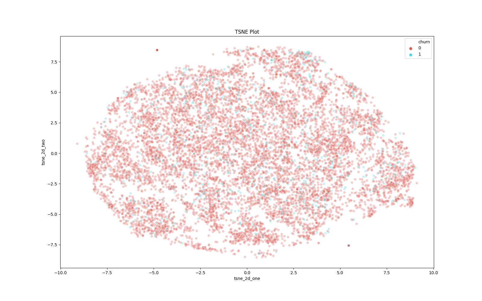
t-SNE: Visualizing Dimensionality
In many real-world data science problems, we have high-dimensional data. That is, our dataset has many, many columns. Using the power of math, we can shrink our dataset into two dimensions and visualize it. Principle Component Analysis (PCA) is a popular dimensionality-reduction technique; however, if our end goal is visualization, t-SNE is our best bet. t-Distributed stochastic neighbor embedding is a probabilistic methodology to determine the optimal lower-level representation of data.
To implement t-SNE, we can run the following function. To note, t-SNE is quite computationally expensive, so we will only run the algorithm on 10,000 rows of data. To note, we only will apply this methodology to our numeric columns.
Our visualization shows that our two target classes are interspersed. This type of visualization tells us our modeling task will not be easy: our classes are not always well separated throughout our data space.
Summary Statistics
Visual inspection of our data is irreplaceable. Human beings are visual creatures. That said, we can also benefit from poring over raw numbers. The following function will produce overall summary statistics along with summary statistics grouped by the target values.
K-Means Clustering as Exploration
K-Means clustering is a powerful unsupervised machine learning model. It's a segmentation algorithm that allows us to find underlying groupings in our data. Running K-Means on our data could be insightful and a worthwhile exploration tactic. We can implement the algorithm and use the cluster assignments to describe our data.
Association Rules Mining as Exploration
Association Rules Mining is a powerful technique to find items that occur frequently, controlling for the items' popularity. This is another unsupervised model that can help us understand the underlying structure in our data. We can implement Association Rules Mining with the following code.
High Correlation Among Features
Inspecting features that are highly correlated also helps with common-sense data cleaning. If two features are highly correlated (e.g. +99% correlation), they may be redundant, and we can perhaps eliminate one of them. This will produce some false positives for dummy-coded features, however. For instance, if we have a categorical column with two values and we dummy-code that column, those resulting two columns will be perfectly correlated.
Connection to the Target
To get a general feel for what features will be predictive, we can analyze their univariate connection to our target. I would submit we shouldn’t use these findings to be too opinionated in our feature selection. Machine learning models can pick up on nonlinear and highly complex feature interactions that humans struggle to perceive. However, having an intuitive feel for what features are predictive can help set our expectations for model performance and feature importance measures. If our model output does not align with our data exploration, our radars should go off and we should investigate. That said, if we can see that a feature has no predictive power whatsoever, we are likely safe to drop it. Let’s insert the following functions.
Univariate Mutual Information Scores
Related to the above, we can run univariate statistical tests to understand our most important features. The following code returns a mutual information score for each feature. Mutual information essentially answers the question "how much does distribution A tell us about distribution B?" This is more powerful than a simple correlation as it can account for nonlinear relationships, though it is more computationally expensive.
Predictive Power Score
We can also leverage a statistic called the Predictive Power Score (PPS) to assess univariate predictive power. This ability is embedded in the ppscore Python library. For each feature in the dataset, we will run a Decision Tree to predict the target. We will then assess if the predictive ability outpaces a naive baseline model, which is either predicting at random or always predicting the most common class (whichever is better is chosen). The model evaluation score used for classification tasks is the Weighted F1-Score (we discuss F1-scores in chapter 12). A pps of 0 means the feature cannot outperform the chosen baseline model, based on the Weighted F1-Score. A pps of 1 means the feature is a perfect predictor (in the real world of business, we should never see a score this high). A score between 0-1 communicates the ratio of the univariate predictive power compared to the selected baseline model.
The big drawback to the pps is the use of the Weighted F1-Score. Don't get me wrong: this is a useful metric. However, we can have a useful model that still has a terrible Weighted F1-Score. This happens in cases where we care about predicting useful probabilities rather than simply the class labels (e.g. churn or no churn). Given the problem, we can develop a totally useful and highly-predictive model that never predicts a certain class (e.g. always predicts no churn and never predicts churn). But the probability output may be strongly calibrated so that we can accurately identify those that will rarely churn (e.g. 1-10% probability) vs those that could realistically churn (e.g. 40-49% probability). Based on the problem and the data, we may never get enough signal to predict the class of interest. The world is noisy and data can often be grainy. That said, we could still produce worthwhile probabilistic estimates that are not reflected in something like a Weighted F1-Score. Now, the ppscore is still useful and can help us glean insights, depending on our use case. A big benefit is that it can latch onto nonlinear relationships whereas a standard Pearson correlation cannot. To implement the ppscore, we can leverage the following function.
Low and High Categorical Dispersion
Spotting features with either high or low dispersion helps with common-sense feature engineering decisions. For example, if a categorical feature only has one category, we can safely eliminate it. Likewise, if every observation is in a different category, we can also safely eliminate that feature. If we have some intuitive understanding of our data, we might also benefit from combining multiple feature categories. We can inspect categorical dispersion with the following function.
Exploration: Putting it All Together
At this point, we should have some conclusions about our data. Those may include, but are not limited to, the following high-level takeaways:
- Overall, our modeling task will be challenging. There isn't much obvious strong signal to predict churn.
- With the above said, our k-means clustering algorithm finds segments of our data with differing churn rates. This is encouraging. Likewise, some of our top association rules (i.e. events that occur together frequently) have lower than average churn rates. Again, this is encouraging - we can find pockets of observations with differing levels of churn.
- We generally observe small, though sometimes noticeable, differences in the distributions of numeric features when segmented by target level.
- We have four distinct values in our churn column, though this is supposed to be a binary classification problem. Occasionally, yes is coded as "y" and no is coded as "n".
- We have missing data scattered throughout the dataset.
- All entries for site_level are null.
- email_code only has one value.
- coupon_code only has one value.
- mouse_movement has at least one extreme outlier.
- Per the density plots, we notice most differentiation in the tails.
- propensity_score, completeness_score, and profile_score have negative values, which seems suspect.
- Based on univariate tests, we might expect the following features to be predictive: average_stars, profile_score, mouse_movement, profile_score_new, and portfolio_score.
- Based on visual inspection, we might expect the following categorical variables to be predictive: marketing_channel, marketing_campaign, marketing_creative, ad_target_group.
- Notable imbalance exists among the levels of categorical features. Most features have several levels, while a handful are binary. In most cases, a small number of levels dominate, and some levels have very few observations.
Finding Optimizations by Profiling Code
In our main method, you'll see that we are timing our script. Knowing the runtime of our script is beneficial in many cases. However, simply timing our script does not instruct us about the exact bottlenecks. In other words, we do not know which functions are slowing down our program. If we knew what these were, we could potentially optimize our code and speed up our script. To understand where our bottlenecks are, we must profile our code. Fortunately, Python makes the task fairly simple.
Before we dive into profiling our code, I want to quickly discuss the topic of optimizing code for speed. In some cases, this is absolutely necessary. If you’re developing a microservice that needs to respond in under 50 milliseconds, code optimization will likely be important. If the service has up to a few seconds to respond, code optimization is less important but something that should still be on your mind – really inefficient code could still pose issues. For our exploration script in this example, code optimization is not too important. The benefit is that we (i.e. the developer) will wait a few seconds less to see our results. In fact, it will probably take us several minutes or perhaps even hours to go through the process of speeding up our code. In the real world, this is often not a wise tradeoff. A common adage in computer science is that “premature optimization is the root of all evil.” In other words, don’t spend time optimizing your code for speed unless you have to.
But rules are meant to be broken. We do not need to profile and speed up our code. However, to show a general process for accomplishing this aim and associated tools, we will do just that. Think of the remainder of this section and the following few sections as pedagogical tools that can be expanded to cases where optimization is truly needed.
OK, after that tangent, let’s profile utilities/exploration.py. We'll first need to slightly amend our main method to the following.
import cProfile
cProfile.run('main()')
We can then run our script to profile the code.
$ source venv/bin/activate

$ python3 utilities/explore.py
You'll see see quite a bit of output in your terminal. The output is sorted in alphabetical order by the filename and then the line number. We're most interested in the lines from explore.py, which represents the actual code we've written and not code from the imported libraries.
All of this output is a bit overwhelming. Rather, we can write this output directly to a file and then explore it. First, let's update our main method.
import cProfile
cProfile.run('main()', filename='explore_profile.out')
We can then run some bash commands.
$ python3 utilities/explore.py

$ python3 -m pstats explore_profile.out
The foregoing command will bring up a new command prompt in terminal. Let's enter the following commands, which will print the 50 most time-consuming function calls.
explore_profile.out% sort cumtime

stats 50
The output tells me that, on my hardware, the most time-consuming aspects of my code are association rules mining, k-means clustering, the SQL query, the t-SNE visualization, and the calculation of mutual information. If I needed to speed up my code, I should likely focus my efforts in those areas. To note, we can hit Control-C to return to our terminal.
We can also get an interactive view of explore_profile.out with snakeviz (you may have to pip install it).
$ snakeviz explore_profile.out
At this point, we can return our explore.py to normal.
We do experience one downside with our current profiling: it only tells us which functions are slow and not the actual lines of code that are sluggish. We can fix this issue with line_profiler. We first may need to install it.
$ pip3 install line_profiler
To use line_profiler, we simply add the @profile decorator above each function we want to profile (i.e. literally put "@profile" without the quotation marks directly above the functions of interest). For example, you might profile create_tsne_visualization, score_features_using_mutual_information, run_kmeans_clustering, and run_association_rules, which we know are comparatively slow functions. After decorating our functions (they're all dressed up!), we can run the profiling and view the output with the following calls from terminal.
$ kernprof -l utilities/explore.py

$ python3 -m line_profiler utilities/explore.py.lprof
We can also profile our memory usage. If we're transforming a large amount of data, such an exercise could be useful. Likewise, if we want our script to run on EC2, knowing how much memory we need will help us spin up an appropriate-sized instance. We shall use the memory_profiler library, which we may need to pip install.
$ pip3 install memory_profiler
Like with the line_profiler we used above, we can add the @profile decorator to the functions for which we want to profile memory. I added the decorator to create_tsne_visualization and score_features_using_mutual_information. We can then run the profiling with the following command, which will produce some nice output for us.
$ python3 -m memory_profiler utilities/explore.py
We can also get a nice little graph of the memory usage over the course of our program. First, remove the decorators. Then, run the following commands.
$ mprof run utilities/explore.py

$ # find the name of the outputted .dat file

$ ls

$ switch out my file name for your's; you'll also need to make sure matplotlib is installed

$ mprof plot utilities/mprofile_20201104225346.dat
Lastly, let's remove the files that our profiling produced.
$ rm *.dat

$ rm *.out

$ rm *.lprof
Speeding up Code with Multiprocessing
Frankly, we don't have too many opportunities to speed up our code. Creating a t-SNE visualization simply takes time and so does running association rules mining. To speed up k-means, we can easily decrease the sample size a bit, which will cost us some insight. Plus, we didn't actually write the code to do the mathematics behind these operations. However, let's say we wanted to calculate the interquartile range for each numeric column. There is no good reason we cannot perform these calculations in parallel. We can use the multiprocessing library to accomplish this aim. Of note, in this particular instance, using multiprocessing may actually make our code slower. The sequential computation is already pretty quick, so we don't have too much time to save. Plus, it takes some time to spin up process workers, which doesn't occur in the sequential version. Therefore, this exercise is more academic than practical. That said, you will see many examples of multiprocessing later in the book, especially in sections about evaluating and explaining our models.
Speeding up Code with Dask
We could also parallelize our code using dask, a powerful Python library for data processing. You can learn more about dask here. We can pretty easily pivot our multiprocessing example from the previous section.
Vectorize Functions with Numpy
If we have a slow-running function, we might be able to vectorize it via numpy, a highly-efficient library that is optimized in low-level C code. We can take advantage of this efficiency in appropriate cases. Per the numpy documentation, "a vectorized function takes a nested sequence of objects or numpy arrays as inputs and returns a single numpy array or a tuple of numpy arrays". We can't just pass in a pandas dataframe and get a dataframe in return, which is a bit of a downside. However, in the correct instance, we can leverage the power of vectorization.
In data science, there could be a case for transforming a value based on a comparison to a baseline. We would be able to turn a dataframe column into a numpy array, run it through the desired function, and then append the returned array as a column. The code below presents two functions for implementing our goal. One cannot be vectorized, and the other can be and is. In the implementation, we use the timeit function to, well, time our functions. The functions need to be self contained, so we create the same array in each function. When I run the script multiple times on my machine, I see the vectorized function is generally faster, though not always. Random variability exists in run times.
Using PyPy
Multiple "backends" of Python exist. The most popular one is CPython, written in C. You're very likely using CPython on your machine. We could actually change the implementation of the Python language specification on our machine and potentially get a speed improvement. To use the PyPy implementation, we first need to install it.
$ brew install pypy3
To run our script using PyPy, we simply need to call it instead of python3!
$ pypy3 script.py
Faster Code with Numba
Numba is a just-in-time compiler for Python. It's goal is to make code faster. Numba compiles functions to native machine code on the fly, and this compilation can be quite fast.
Numba is extremely easy to use. Simply add a decorator to the function you want to speed up. Of note, Numba is mostly used with numpy arrays.
In the below example, on my machine, Numba provides a nice speed up.
Speeding Up Code with Cython
Many of the Python libraries you use and love are optimized in C. This makes them much faster. We can tap into the power of C using Cython. Per the Cython documentation, "Cython is Python with C data types." In other words, we can write Python code with a few modifications and use C data types under the hood for increased speed. One of the reasons C is faster than Python is that it uses static typing. That is, an object cannot change datatypes. Python uses dynamic typing, meaning objects can change datatypes. This means that Python must, in many cases, repeatedly check an object's datatype. This is a reason why Python for loops are slow compared to other languages, especially those tha employ static typing. In the Cython code below, you will see that we declare our datatypes. This obviously will only work if the object is, in fact, static.
First, we need to create a file with the .pyx extension, which will house our Cython code.
We also need a setup.py to package our Cython code.
From the command line, we shall issue the following command, which will create a number of files and allow us to import our Cython function.
$ python3 setup.py build_ext --inplace
We can now run the following script to compare Python vs. Cython.
You can also write a full-blown C extension, though we won't cover that here. In case you're interested, here is a good tutorial.
Writing Command Line Programs
Let's revisit explore.py. It's a nice script that does what we want. However, it can take a while to run. We might want to subset our data. We could easily toggle the amount of data we employ with a command line argument using the click library.
We can run something like the following command from terminal.
$ python3 utilities/explore.py --subset 50000
As you might imagine, this can be a useful way to easily customize our scripts.
Building a Simple GUI
Historically, building graphic user interfaces (GUIs) in Python hasn't been the most friendly process. Frankly, if we want to share an application with a stakeholder or customer, a web app is much better for many reasons. For one, if we update our web application, we do so globally. All intended users will receive our changes. For a GUI, we have to package the application, distribute the updated version, and have users install it. That said, we could potentially build a GUI suited for our own needs. And fortunately, PySimpleGUI makes the task straightforward.
Let's say we were working through a simple data analysis for our boss. We might want to work piecemeal through our data and jot down some notes and thoughts. Rather than pore over a slew of output or adjust our script and re-run multiple times, we could build a simple GUI that would return what we want with the click of a button.
The script below produces a simple GUI to allow us to select the summary statistics we want to see for our dataset. I am going to place it in the utilities directory, though I will likely axe it later. If you run the code, the GUI will pop up; you might first have to click on the Python rocketship logo in your toolbar. If you click on, say, the "mean" button, you'll get the mean of each numeric feature printed in the Python console. If you click on the "median" button, you'll get the median of each numeric feature printed in the Python console. You might notice the print statement is a bit delayed the first time you click a button. This is due to the fact the script must go to the database to pull the data. We could have queried the database earlier in our script, though that would have had the effect of delaying our GUI from coming up. This is a classic cold start problem, but it doesn't matter much since this application is only for us in this case . Either architectural choice would be fine based on our preferences.
Running our Script on EC2
Knowing how to run a Python script on AWS is useful knowledge. The best way to do this is via our AWS Batch infrastructure, which we will set up in Chapter 14. However, knowing how to run a script on a one-off EC2 instance is beneficial. For simplicity, we are going to use the csv version of our data. To learn how to run your script on EC2, watch the following video.
Remember to terminate your EC2 instance once you're done with it!
Link to commands to install Python 3 and pip.
Scratch versions of explore.py and requirements.txt are used for ease. I temporarily housed these in the scratch directory, which is part of our .gitignore. I then later axed the files as they were just samples. To run the original explore.py file, you would need to allow the EC2 instance's IP address in your Python package's S3 bucket policy and in your MySQL security group. Likewise, you would need to set AWS_SECRET_ACCESS_KEY and AWS_ACCESS_KEY_ID as environment variables. It's not hard - I just didn't want to extend the video any further.
Updating our MySQL Database
This section doesn't specifically deal with exploration, but it is born out of what we found during our exploration. We generally do not want to update our source data except in cases where we know it to be wrong. During our exploration, we discovered our binary classification problem had four classes! In some cases, "yes" is coded as "y" and "no" is coded as "no". Let's go to MySQL Workbench.
We can confirm the above finding with the following SQL query.
    select count(*) as "count", churn

    from churn_model.churn_data

    group by churn;
We can remedy the above issue with the following SQL statements.
SET SQL_SAFE_UPDATES = 0;


update churn_model.churn_data

set churn = "yes"

where churn = "y";


update churn_model.churn_data

set churn = "no"

where churn = "n";
Citations
Association Rules Generation from Frequent Itemsets
RIP correlation. Introducing the Predictive Power Score
Look Ma, No For-Loops: Array Programming With NumPy
Click
PySimpleGUI
PyPy: Faster Python With Minimal Effort
Optimizing with Cython Introduction - Cython Tutorial
Pandas Enhancing Performance