Chapter Introduction: Model Explanation
"Machine learning is a black box". I've heard that phrase a lot. In recent years, the machine learning community has brought forth many advancements for explaining models. In most cases, but not all, we can illuminate the decisions of our models. Model explainability also produces feature importance scores to demonstrate how our model operates on a global scale. Broadly, feature importance scores have two main benefits. For one, we data scientists can better understand our models and how they are working. More on this soon. Second, we can more confidently and clearly explain our predictions to stakeholders, thus (hopefully) engendering trust in our work.
Exploring feature importance scores can be an invaluable tool in helping us vet our models. If a feature we thought would be a sure-fire strong predictor doesn't render as important, we have maybe screwed up somewhere. Likewise, if some features we considered to be minor turn out to be predictive, that might be concerning. Again, we might have screwed up somewhere, or one of those features might allow our model to "cheat" by leaking information from the future. Feature importance scores can also give us ideas: perhaps we could engineer more features like the ones that are most predictive.
Thus far, we have discussed what we would call global interpretation of our model (i.e. what features most influence the predictions overall). However, we also want local explanations of our model. That is, we want to be able to decompose each prediction and show why the model predicted the probability it did. Local interpretations can help us gain an appreciation for how our model is working under the hood and either boost or decrease our confidence. In this chapter, we will explore both global and local model explanations.
Note that there is a difference between model evaluation and model explanation. A model can be terrible yet explainable. The two are not necessarily correlated.
Implementation of Model Interpretability
Below is our code for modeling/explain.py. The docstrings explain all of the components. In the remaining sections of the chapter, we will review each function in turn along with some other knowledge nuggets.
Out-of-the-Box Variable Importance Scores
We can get out-of-the-box variable importance scores for logistic regression and tree-based models.
The logistic regression coefficients can be a bit tricky to interpret. Without transformation, they are the log odds of belonging to the positive class. Fortunately, we can exponentiate the log odds to simply get the odds. After exponentiating, the interpretation of the coefficient is such: for every unit increase in the feature, the odds of being in the positive class increase / decrease by the coefficient, all else held constant. We can also translate the odds into a probability with the following: odds / (1 + odds). The previous interpretation is valid, but instead of "odds", we can state the "probability" of being in the positive class. Any probability below 0.5 reduces the likelihood of being in the positive class, while any probability above 0.5 increases the likelihood of being in the positive class. To note, this approach is not how you would derive the predicted probabilities.
We can also pull out feature importance scores from tree-based models. These correspond to the mean impact on the purity of a split that a feature provides. For example, if a feature can be split so that it clearly delineates between two classes (e.g. churn vs. no churn), then it has increased the purity. That is, the nodes will be more "pure" in that they will have a greater imbalance of classes (that's a good thing). Though these scores are easy to access, they are not the most informative. First, they are known to struggle with high-cardinality categorical features. Second, they can sometimes even be fooled by random features (see https://explained.ai/rf-importance/). Third, we can't sum them to get anything meaningful. Fourth, the scores are not with respect to the impact on any given class (e.g. churn or not churn), which makes sense as the tree splits impact both classes. Fifth, the scores are really only meaningful in comparison to one another. An importance score of 0.9 means nothing to me on it's own. The main message: basically never use these scores.
Permutation Importance
A viable alternative is permutation importance. For every feature, we randomly scramble its values in the test set. We then make predictions on the test set and see how much our evaluation metric declines. The more the evaluation metric declines, the more important the feature.
Drop-Column Importance
A comparatively drastic alternative to permutation importance is drop-column importance. We completely drop a feature from our data, retrain the model on the training set, and then evaluate the performance on the test set. The bigger the difference in the new model score compared to the original model score, the more important the feature. The results of drop-column importance can also help us understand how features, or feature combinations, can act as substitutes. For example, Feature A appears quite important at first blush. However, when we run drop-column importance, our evaluation metric does not change much. Why? This could be because the model was able to proxy or replace this feature with others.
SHAP Values
Perhaps the best way to explain our model is via SHAP values. These values provide both local and global feature importance scores. Thus far, we have mostly discussed global importance, that is, how a feature impacts a model on the whole. Local importance explains how a feature influences a specific prediction. SHAP values do something quite powerful: for each prediction, we can see how each feature moved the prediction away from a baseline value. I frankly think SHAP values are the best way to explain models. Therefore, I do not present some of its "competitors", such as LIME. For a thorough explanation of SHAP values, please refer to https://christophm.github.io/interpretable-ml-book/shap.html. Here, we will demonstrate how SHAP values operate via a working example.
One of the "gotchas" about SHAP is that it expects a model, not a pipeline, and preprocessed data. However, we have all our preprocessing in our pipeline. Therefore, we need to perform two tasks.
- Extract our model from our pipeline. In explain.py, we do this on line 463.
- We also need to preprocess our x_test dataframe using our pipeline. This part is not tricky. What can be a bit tricky is mapping the appropriate column names after the transformation. We perform this operation with the function transform_data_with_pipeline, which we call on line 464. This returns a dataframe we can pass into our SHAP explainer along with our model step from the pipeline.
Our SHAP code produces the following files.
- shap_values.csv: dataframe of SHAP values for each observation passed into the explainer
- shap_expected.csv: the expected value of our model (e.g. the positive class rate)
- shap_global.csv: global SHAP values for each feature
- shap_values_bar.png: bar plot of the global SHAP values
- shap_values_dot.png: dot plot of the global SHAP values
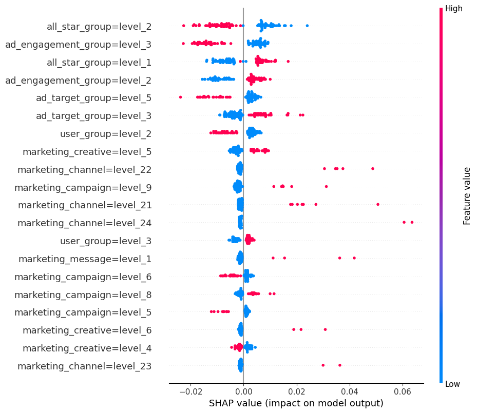
The dot plot is shown below. The SHAP impact is shown on the x-axis, which is the influence of moving a prediction away from some base value (e.g. the overall positive class rate in this case). Each dot represents an observation in the test set. The colors represent relative high vs. low values for that feature.
The shap library provides some additional nifty visualization options. We shall show three kinds of them, which are produced with the below script.
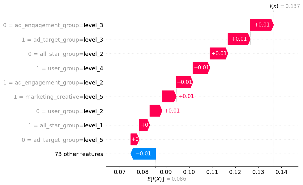
The waterfall plot is pretty cool as it shows how the model reached an individual prediction. For this observation, our predicted probability is 0.137, above the expected value of 0.086. We learn that a few features, in conjunction, drive the probability above the baseline.
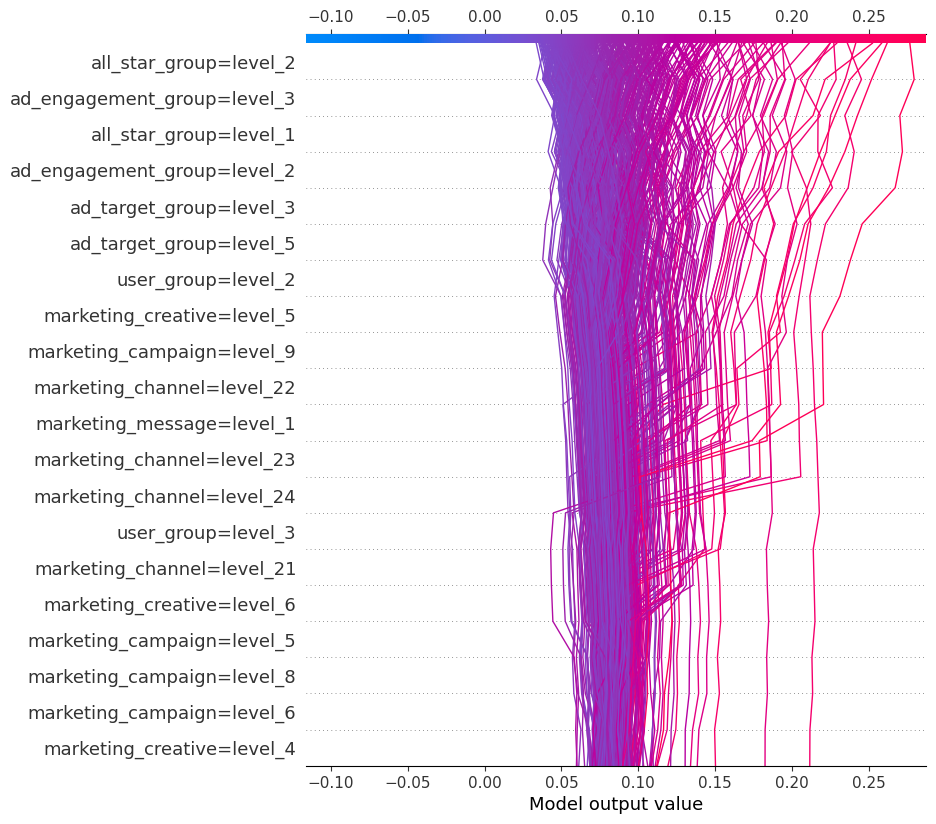
The decision plot is simply an alternative to the dot plot displayed earlier. Each line represents an observation from our x dataframe, which in this case is our test set. As we move from bottom to top, the SHAP values are added, which shows each features' impact on the final prediction. At the top of the plot, we end at each observations' predicted value.
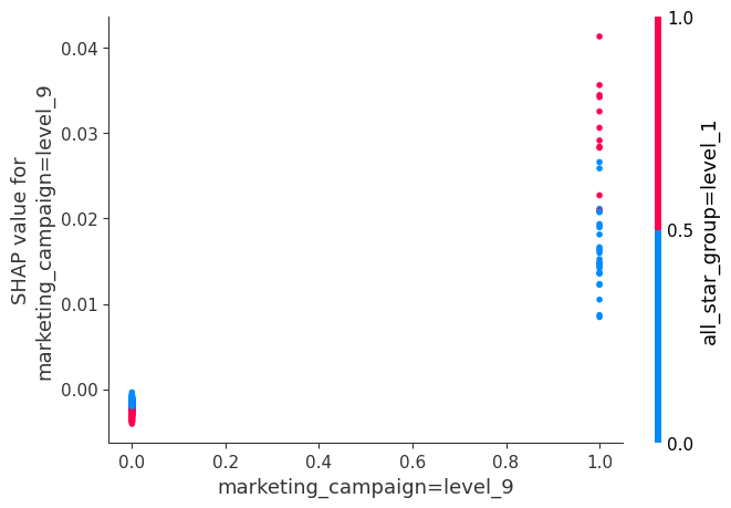
The interaction plot shows SHAP values for two features with notable interplay. We can say that, when the marketing_campaign is level 9 and the all_star_group is level 1, we get a greater movement away from the expected value than if only the marketing campaign is level 9.
Lastly, a couple of important nuances with SHAP values exists. First, our SHAP expected value + sum of SHAP values should equal our predicted probability. When we're explaining a CalibratedClassifierCV, using the TreeExplainer requires us to feed in each base estimator from our ensemble, produce its SHAP values, and then average all the SHAP values. This is all well and good. However, remember that a CalibratedClassifierCV includes a calibrator model in addition to the base models. Therefore, the average prediction of our base models is not necessarily our final prediction. Related, the average of our SHAP values plus the expected value may not equal our predicted probability. If we want this calculation to back out, we need to instead use the KernelExplainer. From the SHAP documentation: "Kernel SHAP is a method that uses a special weighted linear regression to compute the importance of each feature. The computed importance values are Shapley values from game theory and also coefficents from a local linear regression." The benefit of using the TreeExplainer version is that algorithm is optimized for tree-based models and it's, therefore, comparatively fast. That downside is that the expected SHAP calculation may not exactly check out. However, the SHAP values will still be very useful and informative. The KernelExplainer is more generic and slower, but the SHAP calculation will add up. We have to assess the tradeoff and determine what is best for our circumstance.
In the code, you may see check_additivity=False. This is a check in the SHAP library code that our SHAP expected value + sum of SHAP values should equal our predicted probability for an individual model (e.g. standalone XGBoost, base estimator of a CalibratedClassifierCV). Some occasional weird behavior appears to exist with Random Forest and Extra Trees models. This appears to be a known issue, evidenced by several open GitHub issues. From my experience, the error is non-deterministic: given the same exact model and the same exact data, I sometimes get the error and I sometimes don't. My guess, though I don't know for sure, is the feature perturbation is non-deterministic, and this error will occur in trees with certain characteristics. When the error occurs, SHAP claims the model output is something crazy high. This seems to be something the shap library maintainers need to fix, so I just turn off the check to prevent non-deterministic errors.
One last note on SHAP values: many gradient boosting models don't output a probability. The output is a more generic numeric value, but the interpretation will be the same relatively.
Visualizing Trees
Most of the models we trained involved an ensemble of trees. Individually, each of these trees are not great. Likewise, each model builds a slew of trees, and inspecting them all would likely be intractable. However, inspecting a sampling of the individual trees can help us better understand our model and, to a degree, how it's making decisions under the hood. Inspecting the trees can also help us see if our model is "cheating". Perhaps we repeatedly see splits that don't make sense and are simply the result of feature leakage. Even though each individual tree is comparatively weak, we can still get a feel for if the splits make sense or are nonsensical. We can use a package called dtreeviz to help with our worthy aim.
Partial Dependence Plots and ICE Plots
Partial dependence is a concept that allows us to see how our target changes as we vary the value of a feature. Our partial dependence plot supplies the mean response. However, we are also likely interested in the range of responses. We can satiate this want with ICE plots. To create such plots, we take a feature, artificially decrease or increase it's value in our data, and then record the effect on the prediction. More or less, this allow us to show the general dependence between the feature and the target. The code below produces PDP and ICE plots.
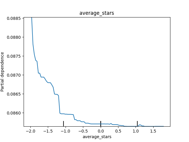
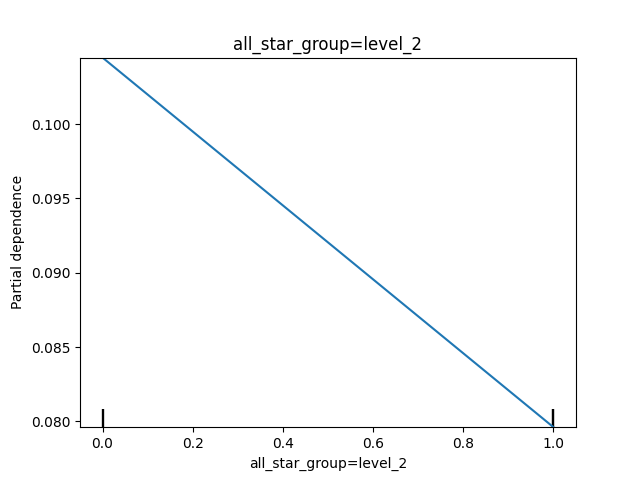
Below are some of our PDPs. We can see that as average_stars decreases (these are the scaled values), the predicted probability decreases, though the overall effect is pretty small. We also notice that when the all_star_group is level 2 (dummy variable of 1), the predicted probability goes down.
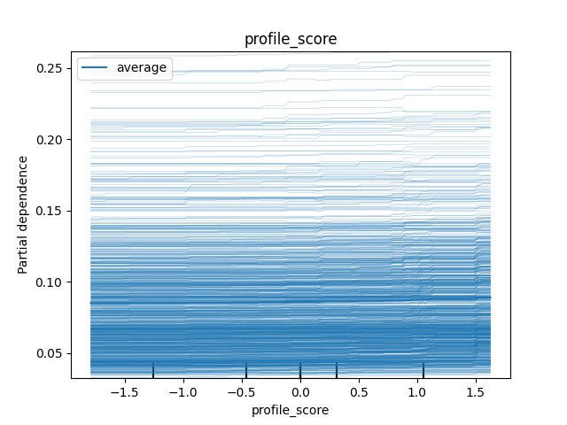
For the profile_score, the ICE plot tells us that the effect is pretty similar across the feature, though we can observe a bit of a jump for certain values on the high end of the distribution.
Accumulated Local Effects
Partial dependence plots are quite useful. However, they cannot be trusted when features are strongly correlated. An alternative is accumulated local effects (ALE). For a thorough discussion of ALE's, please refer to https://christophm.github.io/interpretable-ml-book/ale.html. Please see the code below for how to produce ALE charts. To note, ALE only works for numeric features.